PURpOSE OF POSTER & MAGAZINE DRAFTS
When making our poster and magazine it is key to make drafts as it effectively allows us to develop our ideas and helps us come up with unique ideas that still follow the conventions of a poster and magazine. Drafting also shows us what we did correct and what we need to do better. In-addition it allows us to use the right conventions/change conventions in our magazine cover and poster so that ours looks like the real thing. This page will consist of our drafts, the posters and magazines that influenced them and our final drafts.
When making our poster and magazine it is key to make drafts as it effectively allows us to develop our ideas and helps us come up with unique ideas that still follow the conventions of a poster and magazine. Drafting also shows us what we did correct and what we need to do better. In-addition it allows us to use the right conventions/change conventions in our magazine cover and poster so that ours looks like the real thing. This page will consist of our drafts, the posters and magazines that influenced them and our final drafts.
poster research
Before starting our drafts we did some research on posters through looking at a YouTube video which taught us what is wrong with modern day posters. We watched this video as it relates to horror in terms of layout, colour palette, style. This was convenient to us as we know what to avoid and what to follow to make a successful and typical poster. the information we got from this was as follows:
- I noticed that the use of the colour wheel is useful when using two colours on the opposite end of the wheel from each other as they make each other look good and stand out but this is usually used in action posters.
- hand painted posters were highly liked due to the fact that it showed effort and out of the box thinking, however we will not be using this as it does not fit the conventions we need to meet.
- the use of outlines on the antagonist gives the viewer an ominous feelings. In-addition it makes the poster look more interesting and approachable, the colours and outlines would easily stand out to an audience from 15-35 which is the same as our target audience, this means that we could use a similar design as it would appeal to our audience.
Drawn poster drafts
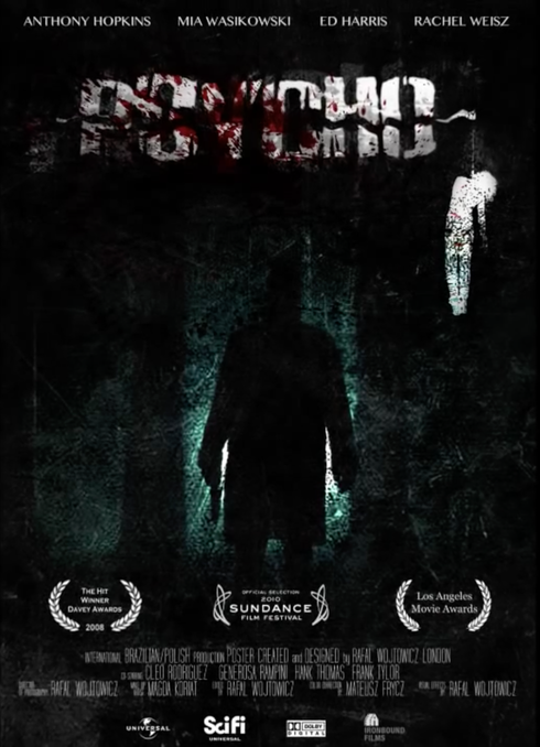
INSPIRED BY:
|
|
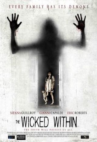
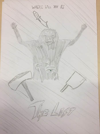
Our first draft is based on 'the wicked within' and we have used similar colours to this poster which are dark. We were interested in the idea of having character in a dark doorway with a shadowy smudged person coming through the door sit made the film look scary and creepy, it also shows that there is no where left to go, our film title is 'the lost' which gives the poster a deep meaning. In our synopsis derrick has to stop his grandfather (serial killer) from killing some one else, this poster fits the story well as he has to find a solution to his problem when there is no one to turn to. We showed this by putting the protagonist in a dark doorway with a mysterious character over shadowing him to show that he has to defeat evil without help from authorities. The use of black and white shows the binary opposite of good v evil fighting which is significant and conventional and will appeal to our audience.
Secondly we have made use of a tag line which is "where will you be", this is a good tag line as it is positioned at the top of the page with a sinister font made to interest the viewer and make them ask their self questions about the film. Another convention we have capitalised on is the title the film, this is important on a poster as it tells the audience what the film is called and that is why we have given it a teared/blood looking affect with a red colour scheme to make the title pop out so it is one of the first things you see. The fact that we have used a bloody font hints that the sub-genre will be slasher as blood is conventional when it comes to slasher horror films.
we have made our poster different from the influence by adding a face to the shadow which is the old man, we have also added a few phallic objects to give the viewer the idea that weapons will be used as different methods of killing.
On the other hand we have not made good use of conventions such as date, age certificate, and production name which is notable as it gives useful information to the viewers to do with the film.
inspired by:
|
|
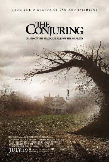
Our second draft was inspired by 'the conjuring' poster, we have followed a similar idea by putting a knotted rope around a knife and we have put cut scene stills of the antagonist and the house and a lose up of the antagonist which makes our poster different. This is interesting to the audience as the house, and view of the antagonist is based in the middle of no where and could connote the feeling of being lost. Just like the real thing we tried to make our poster look creepy and show through the rope that there will be a murderer.
This poster relates to our story as the grandfather kills people in different ways such as cutting them up, and hanging them. Because it is in an unknown place it shows that the hero will be lost and relates to the main title. For this draft the dominant image is a knife that is a signifier of a phallic object and has a rope hanging from it that implies people will be killed in unique ways. this image is similar to the conjuring poster as it has a rope hanging from it as well and leads us to believe that someone will die.
I have also followed the way that credits have been used, positioned and what font has been used. firstly i have put the credits in the same area as the conjuring so that the layout looked similar, i have also used this so that there are texts on the page as thought that the conjuring did not have enough on their poster which made it bland so i added the texts there so that the space was taken up with something necessary, although it isn't visible because it was drawn i would have used a similar font so that there was a vintage look to match the images.
Another thing that i have added is potential quotes from the trailer/film as this will intrigue the audience and make them want to watch it more, putting this text here in the way i have makes it look hand made and that the antagonist could have done it which is scary effect. In-addition using this text was an effective way to take up space and make the poster look creative.
drawn magazine covers
|
inspired by:
|
magazine draft 1:
|
|
|
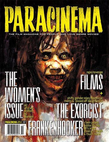
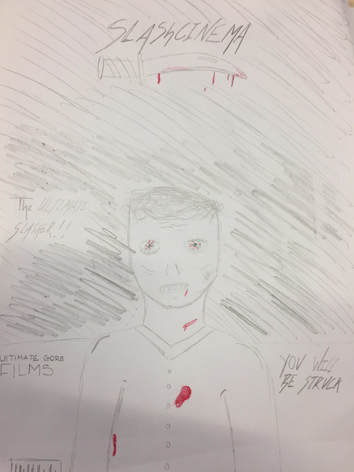
For the second draft I have decided to follow the mid-shot from the magazine paracinema as it clearly shows the antagonist which is the old man who is a serial killer which is partially shown through the blood patches on him. Secondly the knife above him shows that there are phallic objects involved and that this will be a slasher due to the fact that the title says slash in it and there is a knife as an underline which is a conventional weapon to use in a slasher.
The cover lines are done in a different more dragged out font to make the cover look creepy and they also give away that the film will be a slasher. Further-more the expression on the antagonists face suggests that he is angry and ready to kill again which we used from the magazine that influenced us as she is smiling.
Thirdly i have copied the same positioning of the dominant image by placing it as a medium close-up and it has been entered to draw attention to it so that the viewers know a bit about the film. Furthermore i have made sure that the antagonist in the photo was using direct mode of address which is used to give an intimidating and creepy atmosphere to the magazine.
for coverlines i have placed them in a similar place which icon both sides of the page which makes the cover look busy and professional as most typical magazines have coverlids on the side of their magazine. This is effective as the coverlids can be used to inform the audience about the film/trailer and could interest them causing them to be curious about the trailer.
for the background i have made it look dark by shading it in and this is good to use due to the fact that it connotes danger and could foreshadow death. it also makes the audience wonder what might be behind the character. the costume that is being worn by the antagonist in my magazine is a knitwear button up which has been ruined and exposed by blood and this could mean that either he is bleeding to suggest that his victims have been fighting for their life or it could mean that he has killed his victims and has done so in a torturous method.
for the masthead i have put it in the similar spot which is centred at the top, doing this is good because it follows the structure of a usual magazine cover and prevents the viewer from being confused and allows the audience to know what type of magazine they are looking at and what sub-genre it is. Moreover i have written the title in a careless way so that it looks eery and dragged out for extra effect.
|
inspired by:
|
magazine draft 2:
|
|
|
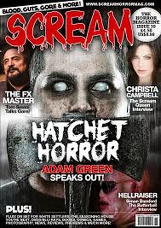
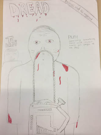
The first draft is inspired by the scream magazine because of the use of the antagonist behind a phallic object, we followed this idea by using a chainsaw in front of the granddad (who is a serial killer) from our story, we have decided to use a chainsaw as they seem gory in horror and our sub-genre is slasher however we aren't sure if we will actually use this weapon in our trailer. We have put the grandpa behind the chainsaw as it tells you that he is serious about killing people in a torturous way for his own pleasure and he is the antagonist in the trailer. By putting the phallic object next to the main image makes the viewer pay attention to the chainsaw which is why blood has been put on the blade to imply that multiple people have died, having blood there also tells the viewer that the trailer's sub-genre is slasher and that there will be excessive amounts of blood.
Thirdly we have also taken advantage of the positioning of the title by putting it side ways which looks unique down the chainsaw which makes the title very easy and clear to see and draws your attention towards the phallic object. As you can see in our magazine there is only one key color which is red to show that the film would be bloody colour and could be shaded darker. apart from the colour red there would be black and white which signifies the binary opposite of good v evil and that the victims innocence could be taken away.
For the layout i have copied this by putting the cover-lines on both sides of the page and i have applied secondary photos to make the cover look similar and official, these coverlids also gove information about the trailer and could result in the audience wanting to watch the trailer more.
DIGITAL DRAFTS
|
Inspired by:
|
digital poster draft:
|
|
|
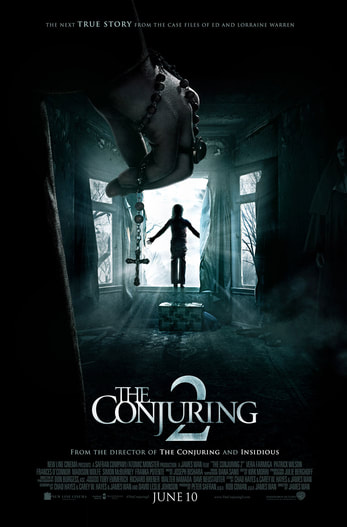
For this digital poster draft I have decided to use the conjuring 2 poster as my influence, you can tell that I have used this poster as my poster follows the same convention as the arm hanging down to the left side of the page, my poster is different from this as I have used a knife as a prop so that you know that our trailer will be a slasher. Our poster is also different as I have decided to use an extreme close-up of eyes as the secondary image rather then a child by a window. The person standing to the left represents the antagonist and that he kills people and the eyes also represent the bad guy as you can see his eyes look angry and sinister. This poster is different as the colour scheme is more to do with blood and few dark colours where as the conjuring poster is predominantly black with a bit of black. I have black and white in a small amount to connote good v evil.
I have justified the credits to the right side of the page so that the close-up of the antagonist could be shown and this made the poster look a little bit unconventional and unique. The font for the credits are quite aggressive and show the nature of the antagonist, the colour red connotes blood which reinforces the angry emotion the bad guy has.
I have justified the credits to the right side of the page so that the close-up of the antagonist could be shown and this made the poster look a little bit unconventional and unique. The font for the credits are quite aggressive and show the nature of the antagonist, the colour red connotes blood which reinforces the angry emotion the bad guy has.
|
inspired by:
|
second digital poster draft:
|
|
|
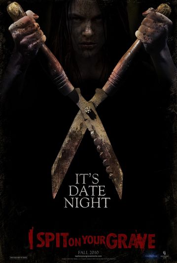
For my second poster I have used "it's date night" as my influence and this is clear as I have used a relatively close to mid-shot that allows you to see the mans facial expression which is angry, and instead of using a phallic object like the weapon used in "its date night" I have decided to use the persons hands to show the stereotype of male power, patriarchy and dominance. Lastly with the dominant image I have made it black and white as it tells the audience that this film will be about good v evil.
for the title we have put it in between the antagonist's hands to make it feel personal as if he will grab you like he has the title, in-addition to this we have used a broken font that comes under the genre of brush which gives the poster a scary unsafe vibe and we have reinforced that through the use of the colour red which signifies blood and death.
I have decided to put the credits in at the bottom which follows a normal convention but I have made them unique by putting blood dripping down them to once again give the effect that the poster is interacting with the viewer. I have used a bright colour which subverts the typical colour palette but connotes good v evil and I used the colour yellow to imply that the victims will 'look into the light' when they die.
|
inspired by:
|
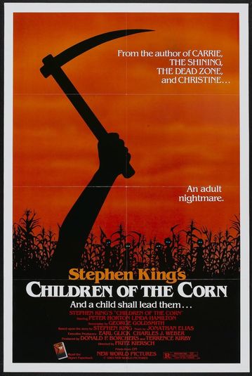
third poster draft:
|
|
|
My influence for this poster was children of the corn and we have followed their idea in a similar way which was through making a weapon (phallic object) the dominant image so I decided to use a flick knife as it is more modern then a pickaxe and looks more interesting for the viewer to look at because there is more detail such as; bloody fingerprints, blood at the tip of the knife were it has penetrated its victim, and light grey to add highlight to the weapon.
On this poster I have added a secondary image of the antagonist with a Long machete in his hand which builds tension for the viewer and shows a muscly looking silhouette of a person which is typically referred to as a male. Using a silhouette and a knife as the images are a good way to tease the audience as it doesn't give anything away and intrigues the person looking at the poster.
In this poster I have also followed the positioning of the credits to a certain degree as I have placed it at the bottom of the screen but it is slightly adjusted to the left to allow room for the knife to go across the whole page as it is the main focus. The font of the credits are the same as the title to show a pattern in hope that the viewers will realise that it connotes violence.
The background for this poster is very different in colour from the influence as it is white and grey, the white is meant to imply that the victims are lost in purgatory and the grey is used to make the poster look appealing and eye catching. Just like the influence it looks very simple but has a deep connotation to it.
The title has ben put in a different place from the inspiration because having the title at the top is a typical place to put it so that people easily know where to look to find the name of the film. It is in red to show that being around the aggressor is a bad and sinister situation to be apart of. The font for this title makes the page look eery and gives an uncomfortable vibe which foreshadows how the trailer could be.
|
influenced by:
|
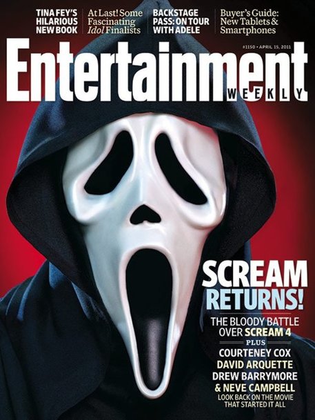
magazine front cover draft:
|
|
|
For this influence i have chosen to follow the conventions of the magazine cover entertainment weekly, i have done this because it looked classy and formal, i will show that this magazine is similar to my draft through the use of the main image, typography, colour, layout, and positioning.
firstly the dominant image is clearly similar as it takes up most of the magazine cover and this is done because it will be the biggest attraction to the audience as it is the first thing that the viewer will look at, our image will grab our audiences attention because of the slit throat effect which tells the audience that the sub-genre is slasher and gives the cover a scarier and more eery vibe to it. Moreover our image is effective like the entertainment one because it looks scary and has a cold look to it which could imply the characters death or close to death.
secondly the layout of my cover is similar to entertainments because we have the title at the top were it normally goes, in-addition to this we have text that is above the title and this gives the cover an official and classy look to it. Moreover my magazine has text on the right hand side of the magazine and it positioned to make the page look clean and has a small amount of text there to ensure that the viewer is not over-loaded with information. i have done my magazine slightly different from entertainments one by adding more text to the left hand side, i have done this to cover up more of the page and follow the norms of a magazine front cover. this layout also shows the audience what to look at first and what is most important as the writing is sized differently.
As you can see the fonts on my magazine cover are highly similar to the magazine that influenced my draft, for a majority of the writing i decided to use bebas neue because it replicated the smart look that entertainment weekly has made. using this font also allowed the page to look professional. there are two other different fonts that are used on my magazine and this was done to make the page look varied and interesting. the first font is Monotype Corsica and this font was used for the word 'plus' and makes the cover look classy as it is an italic font. the last font that used was american type writer and this was used for certain texts such as the website name and the date, i used this font to add an accent to the cover and make it look unique and intriguing.
The colours i used on my magazine are red, white, grey and black. The red is mean't to represent the slasher sub-genre and connotes blood and danger. White implies purity and that innocence is taken away from the protagonists. the grey could suggest potential danger and that there is no light at the end of the tunnel. lastly the black represents the fear of the unknown and that there is a mystery possibly to do with the antagonist.
Digital draft poster
|
influenced by:
|
magazine draft:
|
|
|
for my poster i have chosen to follow the typical conventions of a slasher horror poster. With this poster in which i have reviewed and analysed i have compared it to my own poster and followed the type of font, colour, text and layout of the poster and found a common liking between the two.
the software used to recreate the poster involved the use of Photoshop cs6 which allowed me to edit and create my poster. I firstly started out with my background and how i used various different tools such as the eraser tool, this helped me to merge the backgrounds together to make it look as one. with my main dominant image being the centre of attraction I used different image effects to make the slit throat stand out. as the sub-genre is slasher the image helps portray that to the audience as the figure with a slit throat may denote that the character had been cut with a knife, This may also connote that the use of a phallic object shows a role reversal or emasculating of a male character.
secondly the billing block located on the bottom of the poster is a conventional aspect of a movie poster as it states the important credits of who was involved with the film. To help me create this i used my influence to help me create a near enough identical version of it. Furthermore I researched the specific different fonts and sizes that billing blocks usually acquire. In addition to this with the layout of the billing block being important it seems the wide structure of a billing bock makes my poster more effective.
Thirdly to apply the typical conventions a of a horror poster the layout of the image and the special effects on the image are all important as they help implicate the conventional meaning of a slasher horror film. with the victim placed as the main dominant image it hides the identity of who the antagonist is and his main intention.
