evaluation question 1:
In what ways does your media product use, develop or challenge forms and conventions of real media texts?
conventions are elements found in texts which are typically seen in every genre. Real media text use them in their products which allows the conventions to be associated with a particular genre. Conventions separate genres from each other for the audience. so therefore, they must identify the genre/sub-genre and bring their expectations. it would have to be met for them to be content. this question focuses on all the conventions we used in our media products. This includes our magazine, poster and the trailer. We'll be comparing our work with real media texts to see how we either used , developed or challenged. by joe
todorov's theory by joe bikuta
Todorov's theory suggests that all narratives follow a 3 act structure. equilibrium , disruption and resolution.
|
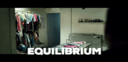
the equilibrium is the first moments of a trailer which involves dialogue. it also sets the mood and atmosphere of the trailer. unfortunately, there is no equilibrium in our trailer as we followed a specific teaser trailer structure.This structure is typically used for real media texts. having an equilibrium did not fit the trailer because it would have given away the ending and the intention of the film and instead we replaced it with a jump scare of the antagonist in a prison cell.
there is no resolution in our trailer as it would spoil the plot of the story. A trailer which has no resolution is common in real media trailer. if one was added to a trailer, it would affect the whole film financially and cause the company to lose money. Real media trailers that have resolutions are carrie (1976) and terminator: salvation. To end it, we used a montage to end it in order to build up anticipation.
|
the disruption is the moment where an event has occurred which causes everything to go wrong. This moment is found our trailer as the girl stumbles upon the antagonist. This is key as it builds up tension and anticipation in the trailer. A disruption is also found in real media texts such as oculus (2014). We used this in our trailer as it commonly found. in real media texts . 
|
a Real media text that uses this is light outs (2016) . This trailer uses equilibrium to set the mood of the trailer. On the other hand, we challenged todorov's theory as we only used one act out the three acts in our trailer. Either the equilibrium and/or disruption but never the resolution.
there is no real media trailers which contain a resolution. therefore, All real media trailers subvert todorov's theory. However, some real media trailers have a equilibrium so they conform to the theory to an extent. Also, this is only the teaser trailer so not a lot is meant happen. Only in the full films is where you can find the todorov's theory being applied. Montages are commonly used in real media trailers therefore, we applied it to our trailer
|
Camera techniques by joe bikuta
Camera shots are used to demonstrate different aspects of a film's setting, characters and themes. As a result, camera shots are very important in shaping meaning in a film.
|
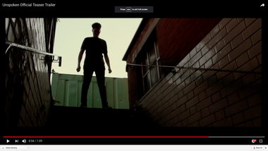
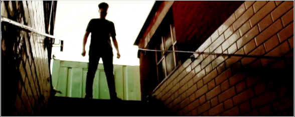
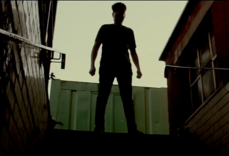
We used a low angle in our trailer. The purpose of this is to make the antagonist appear more menacing and to demonstrate the status between the protagonist and antagonist. a Real media trailer who also done this would be " friday the 13th " . We developed this angle as we made it look like a silhouette. This makes more scary as the audience is unable to identify the killer.
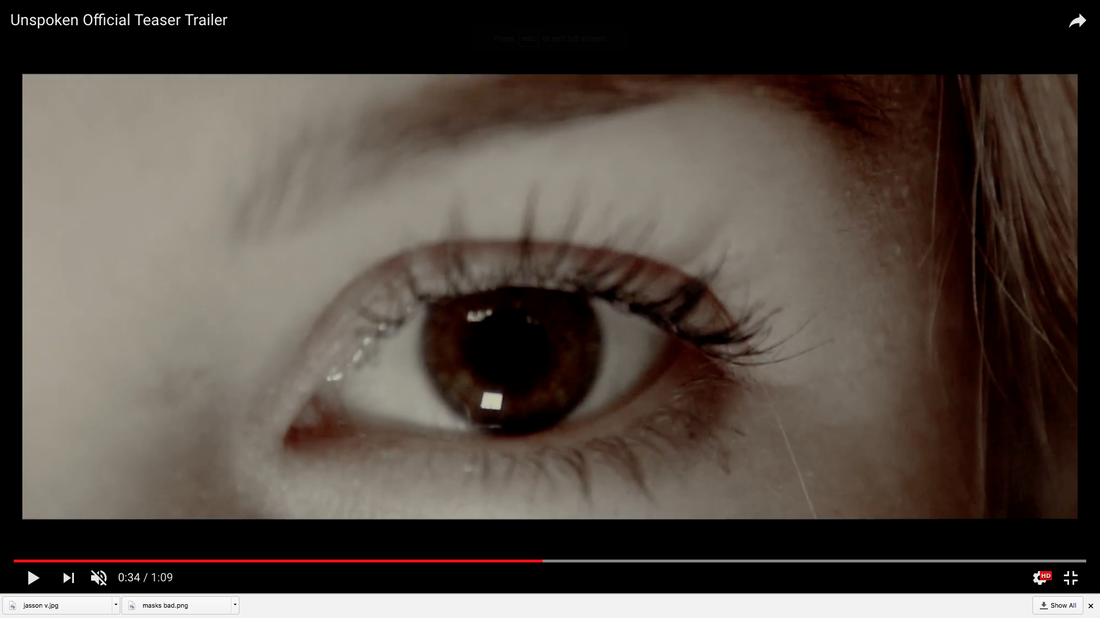
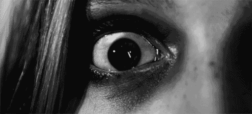
we used an extreme close up in our trailer. The purpose of this is to demonstrate the fear shown within the trailer. In this moment, the female was being chased by the antagonist and we wanted to show that she was scared
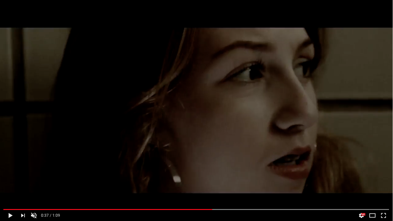
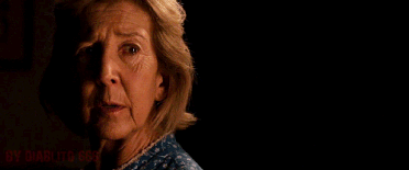
We used a close up in our trailer as it is a typical convention used in horror trailer. It is uses to display the victim's facial expression. In our trailer, we demonstrated the female's face as she was scared.
|
|
|
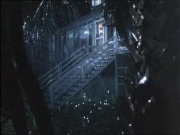
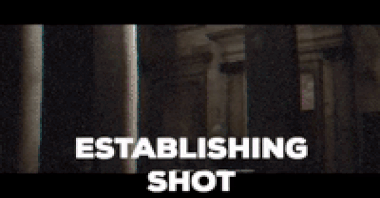
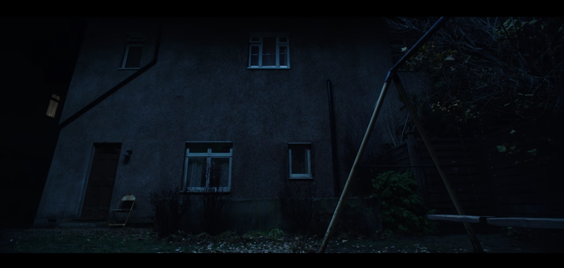
The first shot that the consumer will see in our teaser trailer is an establishing shot of a building which is used to set the atmosphere of where the trailer will be taking place and this is why we used an old looking mansion because it looks scary.
With the angle we used a pan (upwards) and this was done in-order to let the viewer know what they are dealing with and the fact that this pan is upwards could connote that you are being looked down on and that you are inferior and makes you feel helpless, this is done to let the audience know what the protagonists will be feeling. |
|
The next camera angle that is seen in the trailer is a medium close-up of an old and broken statue. The use of having the camera relatively close allowed everyone to see what they are looking at with is something that is old, broken and unlooked after. We decided to keep the angle still because having no movement shows that the statue is isolated and lonely which is done so that the viewer understands the emotions of certain characters.
The third camera angle/movement that is integrated into the trailer is a tracking shot that follows along a corridor and then pans upwards into the darkness. this shot is done to connote that the characters are very lonely and that they have no where to hide. the darkness also connotes danger and death for the protagonists.
This shot was followed up by another track but was a handheld tracking shot that panned right onto a long shot of the protagonist. The handled track was done so that the viewer had the feeling of interaction because it was purposely unprofessional to make it seem like a character in the film was doing it. The pan right was done so we had a way of connecting the two shots together and makes the shot look like its from the antagonists perspective and he is nodding to the right. the long shot shows that the character is small and lower then the antagonist.
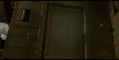
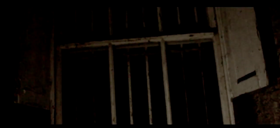
The next shot is a wave from a prison cell wall to a window and is looking up. this scene connotes that death is near by and is meant to portray the protagonist looking into the light as they die.
sub-genre by joe bikuta
Here is a slideshow which tells you what sub-genre we decided to choose and the conventions in the sub-genre.
sound
by Charles Whitewood
|
Diegetic sound - can be defined as sounds that are made by or heard by the characters in the trailer/movie and heard by the audience watching it. An example of this would be when you hear a door slamming loudly. This is a highly conventional and essential convention to use as all trailers use it and it can be used to inform the audience of what is going on or it can be used to build tension in a particular scene. This has been used in almost if not all horror trailer made such as; Insidious 4, just 10 seconds into the trailer you can hear the female protagonist using heavy breathing to build tension.
This was used in our trailer because all viewers can relate to it and can be expressed easily even with a low budge. I knew what types of diegetic sounds to use in our trailer through research and planning by looking at multiple different exemplar trailers such as: jigsaw (2017) / cabin in the woods. For my trailer we used door slams, screams and a laugh as they were diegetic sounds that were key to make the trailer conventional and understandable for the viewer. The door slam can be heard at 0:27 seconds and the scream can be heard at 0:54 seconds and the laugh can be heard at 0:37 seconds. Non-diegetic sound - This is sound that can only be heard by the audience of the trailer and not heard by the characters in the trailer, the most prime example would be the soundtrack which is used to make the trailer intense and to make the viewers curious of what will happen. Furthermore using non-diegetic sounds are very conventional and can be effective if used correctly. For the duration of our research into specific sounds we were able to find out what sounds best fitted a typical horror trailer. these sounds were then used in the sound design because they came across as the most stereotypical and effective, the sounds are as follows; title booms, ascending notes, drones, and a heartbeat. Those sounds are used often because they are recognised by viewers and relatable. for example we used title booms towards the end of our trailer at 1:01 to keep tension high and to follow important conventions, the same sort of title boom was used in the wicked teaser trailer at 1:02 BUT WAS MORE SUTTLE.
|
|
editing
by Charles Whitewood
|
Editing is one of the most important aspects when making a trailer due to the fact that it gives each shot meaning and makes the trailer look realistic and structured, with the required structure the trailer would just be a load of random shots put together. The use of transitions are what allow the audience to understand when you are going from one scene to another or when there is a change in atmosphere. Through looking at research at all different transitions we found that the most adequate transitions to use would be a fade to black and a cut.
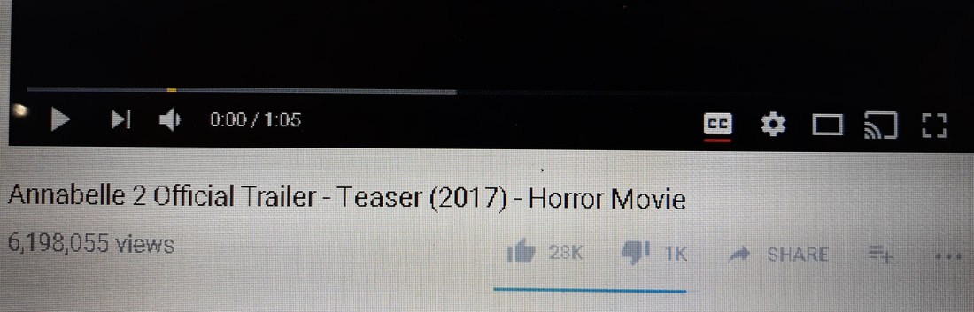
We used fades to black predominantly at the start of the trailer because the pace can be set set slowly with fades as they are feint in movement were as towards the end of the trailer we used cuts because they abide to the rapid change in paced make the montage look professional. Clear use of fades to black in our trailer would be at 0:15 seconds when we cut from a dark wall to a caged window and a good use of a cut would be at 0:56 seconds when it cuts from the antagonist to a close-up of the protagonists eye. These transitions were highly effective in our trailer as they give the audience a sense of panic and a change in speed. In comparison to real media texts, a great example of cuts would be Annabelle 2 as they use the cut transition to go from scene to scenes or view to view. The difference between our use of transitions and real media text transitions is that we picked particular scenes to apply the transition were as they were experienced enough to manipulate the transition to fit around their whole story. |
|
colour correction
Another key convention used in editing would be colour correction as we didn't have the correct lighting in every shot, so we applied this tool in editing so that all of our scenes had low-key lighting to show consistency and prevent the audience from any confusion, by making the scenes the right colour grade it helps the trailer follow and use typical lighting in most horror trailers. We used colour correction at 0:56 seconds due to the fact that when we shot that scene it was not dark enough outside so we added a darker tint filter to that clip. Using this tint also allowed the antagonist to look more scary because it looked more like a silhouette and disguised his identity. the examples used clearly demonstrate how much a sane can be changed in order to aid it in looking like a conventional scary horror scene. Lastly as you can see with our trailer in comparison to a real media example we have not been as strong with the use of colour correction as we have just made small adjustments to the clip to make it seem more eery and to match the horror stereotype.
our trailer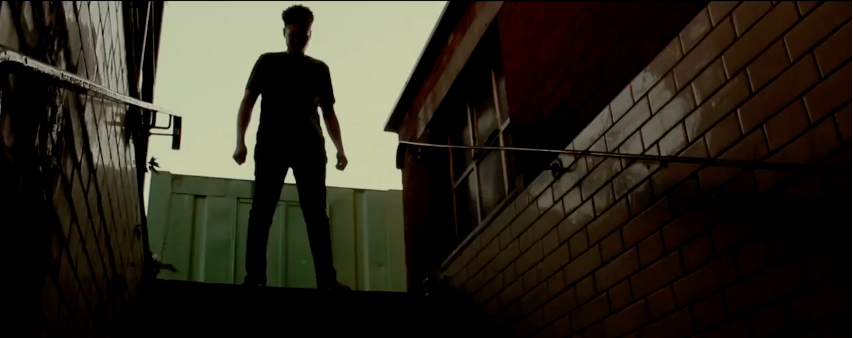
|
real media text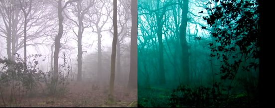
|
setting
by Charles Whitewood
Trailer
the whole point of having settings or locations is to create a particular feeling or vibe for the audience to see your trailer. Having your trailer set in certain places can portray and give of the extra effect that something is going on, for example: if a trailer is set in a mental hospital it is likely that there will be a psychopath that kills a lot people which would make it a slasher sub-genre or if you see a graveyard it is probable that it will be a zombie trailer. However we partially challenged the typical slasher sub-genre as we didn't have our trailer set in a hospital, we had ours set in a prison which was done to show isolation and make the consumer feel discomfort, powerless, and that the antagonist was superior to everyone else. we also had it set in an anbandoned looking mansion, this was used to give off he effect that the protagonist did not have control of any outcome as they were lost. I believe that this worked due to the fact that it was shown when the female protagonist was scared in one of the prison cells.
Magazine
Setting also applies to the magazine due to the fact that it is typically used for the background and can give the audience a particular vibe or certain atmosphere, an example of this would be adding a plain black background could connote being lost or the sense of danger/death. Setting can also be used in-order to follow the usual conventions of a horror magazine which will help the viewer understand the structure and will prevent confusion.
Our horror setting |
typical horror setting |
Lighting by Levi bent
|
our trailer
|
real media text
|
|
|
|
low key lighting can be seen as a typical convention for the slasher horror sub genre as it conveys a sense of mystery towards the audience which applies to Altman's theory. Furthermore low key lighting may also imply that darkness is a key element in a horror film which enables it to create the illusion of evilness. Finally the idea of using low key lighting in our piece sets the tone of our trailer and allows it to have an eerie feel.
|
in comparison with real media text, low key lighting is also evident here as it is a typical convention which conveys the horror genre. subsequently low key lighting also sets the setting and mood of a film enlightening the audience of the of where the production is set. in addition the timeline for montages comes near the end of a trailer as it shows the climax to the film.
|
length by levi bent
|
Our trailer
|
Real media text
|
|
|
|
The length of our trailer is just over a minute which would be classed as ideal from the perspective of a teaser trailer, as it follows the conventions of other real media text that follow this form. there is a typical structure that is meant to be followed as it helps create tension from following the right timings. With the beginning section meant to filled with establishing shots, helps set the scene for the trailer.
|
for example the 'annabelle 2' teaser trailer coincides with the length of our trailer as it focuses around the one minute mark. in addition the timeline for montages comes near the end of a trailer as it shows the climax to the film. with the climax of the film coming near the end of the trailer, it is pivotal to allow the audience to build tension in order to create a positive effect from.
|
character by levi bent
BILING BLOCK/CREDITS BY DANIEL ABESHIN
|
To make our products authentic, we followed the convention of having a Billing Block. We also replicated the same style that would be found in real Film Posters such as Conjuring and Saw franchise. This meant that our poster would be Recognisable by fans of the slasher sub genre, who would be enticed to see the real film. The Billing Block was used in order to give credit to the various cast, crew and production companies that were involved in the making of the film. We also adapted this convention in our Horror Film Poster in order to be consistent with our House Style across all of our products.
|
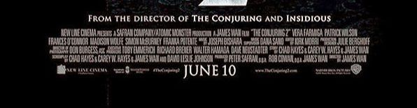
In our Horror Film Poster, we were inspired by other horror Film posters such as the Conjuring 2 Film poster, which had a billing block that contrasted with the background colour. In Horror Film Poster, there is typically use of iconography in order to generate more interest in the film and to increase the ticket sales of the Film, by including well known actors as cast members. For example in the Conjuring 2 Film poster iconography was used with notable cast members such as: Patrick Wilson and Vera Farmiga . We were not able to replicate the use of iconography in our trailer as we did not have a large enough budget for such well known actors. we used group members and people from other groups in our trailer. The billing block gives recognition to the production and marketing compaines and is a legal requirement.
|
OUR PRODUCT |
REAL MEDIA TEXT |
|
|
|
BILLING BLOCK IN our TRAILER
|
BILLING BLOCK IN real media text
|
COSTUME BY DANIEL ABESHIN
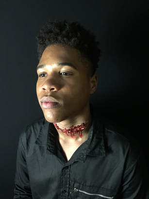
As shown, we have dressed the antagonist all in black as it is appropriate and conventional due to the plot of our trailer. As shown in the real media text. Costume is key in terms of how conventional a trailer is as it portrays in the characters in certain ways to demonstrate a certain idea to its audience. It sets the tone of the trailer and gives it an dark atmosphere. we dressed LEVI in THIS COSTUME to portray his dark nature and evil tendencies. We used this typical convention of horror movies.
|
|
We used props, clothing and costume effectively and consistently in our trailer to connote the nature of the trailer meaning and portray our sub genre effectively. For example, the victim is shown wearing white and the protagonist is wearing all black. it was essential that she wore a white shirt in order to connote her purity and innocence. This is conventional for horrors as the victim usually wears something white to symbolise their innocence. In contrast to show binary opposition between the victims and the antagonist, the antagonist is usually denoted in black or dark clothing. We therefore used this convention to connote death, evil and the unknown. Moreover,
title slates BY DANIEL ABESHIN
title slates are NECESSARY IN trailers AS THEY GIVE INFORMATION TO THE AUDIENCE. I BELIEVE we use this convention effectively TO COMMUNICATE TO OUR AUDIENCE. We USE them from 0:00-0.05, 0:45 and 0:38-0:50. this gave the audience just information about the movie to entice them. It also hints type of characters included in the movie. we develop the convention by adding in our tag line that appear on our magazine and poster so that the film is more recognisable to audience. However, unlike real media texts we did not include social media links at the end of the trailer. Real trailers such as 'The Conjuring 'and 'saw' use these conventions but sparingly. For example, "let the games begin" and "death is a shortcut".
title slates can be used as a tool for scaring the audience as they would usually be jump scares or other frightening things seen after a set of captions. Real media texts do tend to follow this conventions hence the reason why we have include it into our trailer.
title slates can be used as a tool for scaring the audience as they would usually be jump scares or other frightening things seen after a set of captions. Real media texts do tend to follow this conventions hence the reason why we have include it into our trailer.
We used the conjuring 2 in order to work out effective timing for different aspects of our own trailer, for example the captions.
This is an important convention that is used in all trailers and can be seen in many real media texts. We decided to follow this convention as it can be used in order to reveal to the audience what is going on or what may happen without having to use dialogue. This is often effectively used as indication of something bad that is going to happen.
There are many examples of captions in real media texts which have the same effect which we desire from our own film. They tend to be used when the trailer is build up which then create suspense upon the audience as they will not know what to expect. The first captions often reveal other films that are in connection with the film trailer. We decided to use the captions at similar times that they were included in the Conjuring 2 trailer as we know that this film is very effective and therefore by following the same conventions hope that it would have the same effect.
OUR PRODUCT
|
Tag line for trailer - "words are life or death"
|
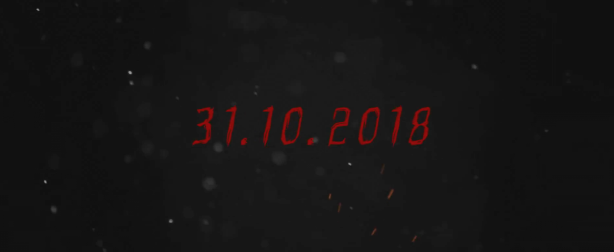
Date for when the film is coming out to show the audience
|
we followed the conventions of including a film title on our Film Poster. we followed the conventions of putting our film title at the top of our trailer. we followed the convention of maintaining a consistent house style through all of our media products, as we used the same typography for our Film title in all of our products, this was done in order to make sure that the brand of the film was recognisable and marketable in all of our media products.
We identified this convention in Real Media Texts such as the Insidious 2 Film Poster which includes the main title. By including the Film Title as the largest part of the page, the audience is able to quickly identify the Horror Film , Moreover we also made use of the colour red in our film titles in the same way that Insidious did in order to be consistent with our house style and it also improved the overall aesthetic of our Film title and made it more eye-catching.
real media text
|
release date for conjuring 2

|
tag line for conjuring 2
|
conclusion
Overall, we used the conventions in Real Horror Film Posters, trailers and magazines. this makes our products recognisable by fans of the Horror Film Genre. Furthermore we were also inspired by the Real Media Texts in how we could adapt existing Horror Film poster conventions in order to suit our original Film Poster. Moreover we also included key conventions such as the Production Company Logo and The Film Title in order to effectively market the branding of the Film as well as the brand of the Production Company, which will lead to an increase in ticket sales for the Film and higher profits from the Box Office. this makes our products overall extremely profitable and marketable.
