evaluation question 2:
how effective is the combination of your main products and ancillary texts?
Cross media convergence - is really a term a that refers to companies coming together vertically or horizontally. an example of this is The Walt Disney Company making use of its other companies to gain access to stars and a better distribution network for their films.
brand identity - some of these items are the logo, items and typography e.g; claws, mask and the puppet from jigsaw. they shape the products and create an appeal. it is the message the consumer receives from the product, person, or thing..it should be a consistent message received by its audience.
synergy - the interaction or cooperation of two or more organisations, substances, or other agents to produce a combined effect greater than the sum of their separate effects.
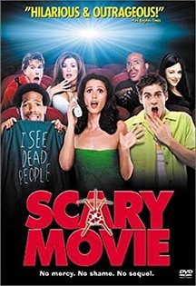
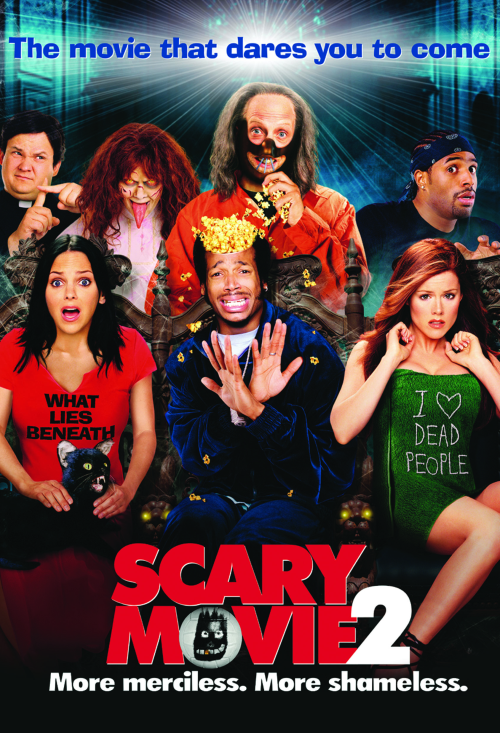
sequel + franchise - a product that continues the story or develops the theme of an earlier one. for example scary movie & scary movie 2. A media franchise is a collection of related media in which several derivative works have been produced from an original creative work, such as a film, a work of literature, a television program or a video game. by daniel
brand identity - some of these items are the logo, items and typography e.g; claws, mask and the puppet from jigsaw. they shape the products and create an appeal. it is the message the consumer receives from the product, person, or thing..it should be a consistent message received by its audience.
synergy - the interaction or cooperation of two or more organisations, substances, or other agents to produce a combined effect greater than the sum of their separate effects.
sequel + franchise - a product that continues the story or develops the theme of an earlier one. for example scary movie & scary movie 2. A media franchise is a collection of related media in which several derivative works have been produced from an original creative work, such as a film, a work of literature, a television program or a video game. by daniel
examples of synergy and media convergence by joe

These are examples of real media which have gone through media convergence and synergy. These are products that have been produced via this. This is very important as it widens the audience for the franchise and it builds up a fanbase.
success of other real media texts
by charles whitewood
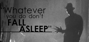
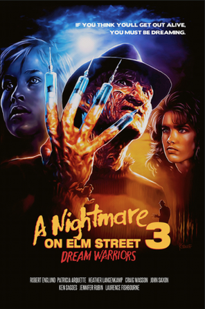
A nightmare on elm street is a highly successful franchise through out the horror film industry. This film has become very recognised globally and they have been able to capitalise on this through cross-media convergence and synergy during their films life time. They have done this by creating products that match the film and the time period as a way of promoting and marketing their film by creating other products.
|
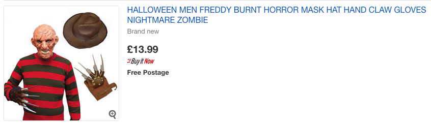
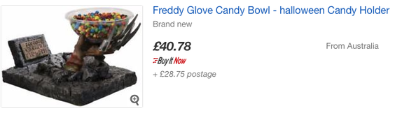
A nightmare on elm street has provided it's customers with loads of varying merchandise to fit multiple different target audiences, an example of this would be that they have made loads of toys and board games that can be targeted predominantly towards children. secondly they have made particular pieces of clothing such as socks which can be worn by mostly teens and adults. they have made bowls that could appeal to teens and children also which is a great way to promote their film due to the fact that there is something for everyone to be interested by.Moreover the merchandise will be highly promoted because it is working in synergy with the film. For the duration of these products the company has managed to be consistent by involving the main character (Freddy Kruger), the logo, and the colour scheme from the film. This is effective because it mean't that the company were able to create give it a good brand identity. for example with the bowl and the toys they have clearly denoted Freddy Kruger and by doing this they have created a recognisable icon that can be remembered and referred to when using/seeing the merchandise. Another thing that has become recognisable would be Freddy's iconic claw which has become so popular that replicas and the real thing are being sold for very high prices which has lead to some hardcore fans becoming collectors.
|
|
|
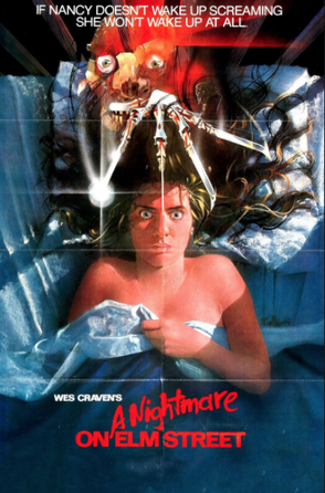
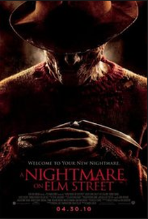
As you can see from the two posters,they have evolved a lot from 1984 to 2010 but have still managed to keep a lot of the main elements that make the poster recognisable as they have kept a similar colour scheme and denotation. It is evident that they followed a similar structure due to the fact that Freddy cruger's claw are big attraction and gain a lot of the audiences attention when looking at the poster. In-addition to this the poster still features the title at the bottom of the poster that is coloured red to connote blood an death. On the other hand the poster has slightly evolved due it becoming slightly darker and less artistic. This is typical as it is done to follow the time period and demand from the audience as they have become more desensitised. Going into more detail it is clear that they have kept the same creepy effect if not they have added to it as from the 1984 poster there is Freddy's claws were as the 2010 poster Freddy is the main image and shows the claw.
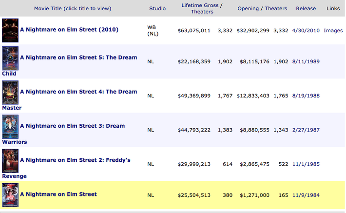
Between the release of the first and last film a nightmare on elm street has grossed a minimum of $232,000,000 just from the films. This is without the profits from merchandise. |
|
a nightmare on elm street trailers
|
|
|
|
|
merchandise from the film
|
|
It is evident that the props, costumes and colour scheme is used through out with their products like the Freddy cruger costume is identical to the film character which is widely popular especially during halloween. With the other image you can see that it denotes the claw that is heavily relied on as a phallic object in the films is being used as a trick or treat bowl which will target adults and children for halloween.
A nightmare on elm street is distinctly popular and highly well-known through out the world and it definitely is a classic horror film that shaped the way slasher sub-genre films are made and can e credited for the development of horror for the duration of its time. In-addition to this as the films have changed they have managed to keep control of their logo, colour scheme and costumes which is what makes them unique and easily recognised globally.
gross for the franchise
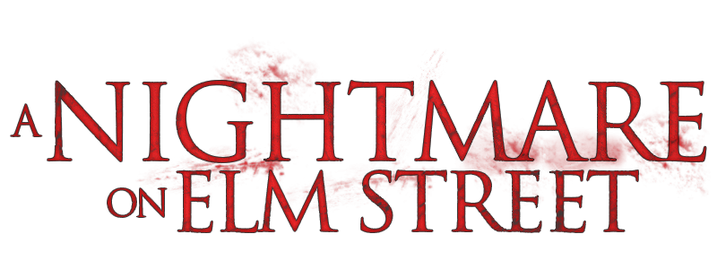
the franchise and it's branding development
Through out the development of a nightmare on elm street's logo it has managed to keep its typical colour scheme of red to connote blood, danger and death. Moreover it also tends to keep it's font through the duration of most of the titles apart from the 2010 remake which is normal as it shows the development and change over time.
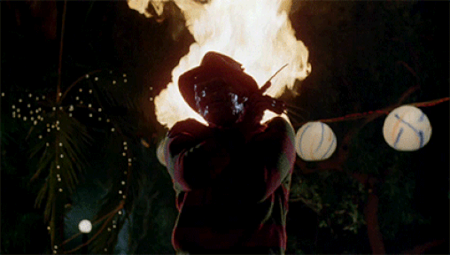
As we already know a nightmare on elm street is very well known and iconic for the horror genre and has been a big contribution to the horror genre being so good and well known. Through watching these films it is clear that the franchises branding comes from the main antagonist, Freddy cruger. This character is what makes the film so special and replicates the logo in that everyone can recognise what they are about to watch just based on his claw or part of his face. Even without Freddy being the iconic character there are other aspects to do with the film that make the film what it is as everyone can relate to having a nightmare in real life which creates a fear factor of it happening to them.
|
|
As i have demonstrated though out these images it is evident that A nightmare on elm street has managed to branch out by creating comics also which could have contributed to the franchise being so iconic and could have publicised the brand before it's film release. In-addition to this by having different formats of entertainments such as film, comics, toys means that they can have a wide range of audiences as the toys target children, the comics target collectors, kids, teens and the film targets anyone that fits the age certificate. Moreover by sticking to their colour scheme and typography it allowed them to have a strong brand identity. This has lead to the franchise having the advantage of a big audience.
re-makes, spoofs
|
|
|
These four examples and several others on youtube clearly show that a nightmare on elm street i hugely recognised and very popular as people have re created the film in their own way by making trailers, short films, and even music videos. the fact that people have re made this iconic film through different ways such as music demonstrates that film is known worldwide and it gives he film more publicity for newer audiences that have not yet seen the original, this could also attract younger audiences as it is funny. Moreover these re-makes are based by giving information about the iconic antagonist and playing on it in a funny way by subverting the characters typical behaviour such as making him seem kind. This will also seem interesting to older audiences that saw the original because it's different.
by levi bent
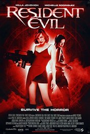
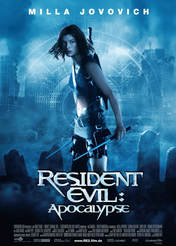
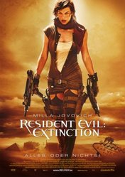
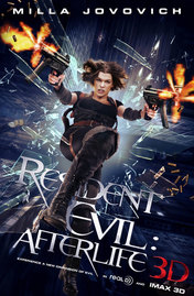
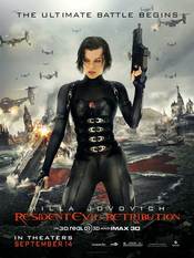
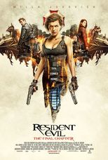
resident evil is a zombie apocalyptic film that is highly favored amongst horror fans as it is a science fiction action- horror hexalogy. with the film's franchise being a success, adaptations of the film have been produced through video games, clothing, accessories...etc
although resident evil isn't the same horror sub-genre as our own horror trailer, resident evil used cross media convergence and synergy to help promote and gain a wider audience.
although resident evil isn't the same horror sub-genre as our own horror trailer, resident evil used cross media convergence and synergy to help promote and gain a wider audience.
trailers for each film:
|
|
|
|
|
|
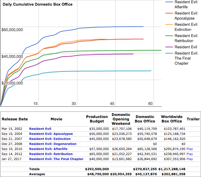
there are a total of six films worldwide which make up the franchise resident evil (2002), Resident evil: apocalypse (2004), resident evil: extinction (2007), resident evil: afterlife (2010), resident evil: retribution (2012), resident evil: the final chapter (2016), which grossed a total of $271,274,006 worldwide.
resident evil parodies
|
|
|
|
the parodies created are by fans who have an love interest for the film franchise. the importance of this is significant as it helps promote the franchise to certain audiences who haven't seen the films.
Brand identitythe typography of the resident evil logo is distinct as it has a certain style and font added to it. the fact that the 'R' is positioned in a way, it allows for the logo to be more recognisable. in addition to this the typography is different from the game and film as the game logo has a more block font.
|
|
|
PROFIThere to the left is a data chart showing the profit made from each film in the franchise. it is broken down into worldwide box office, opening weekend, domestic box office and the production budget. First of all we see how resident evil: retribution which had the highest production budget value received an average box office total which allows them to make another installment of the film. clearly the film franchise has been very successful collecting a worldwide box office over $1 billion.
|
merchandising

by joe bikuta
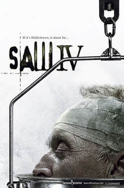
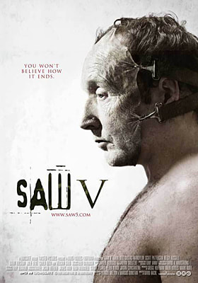
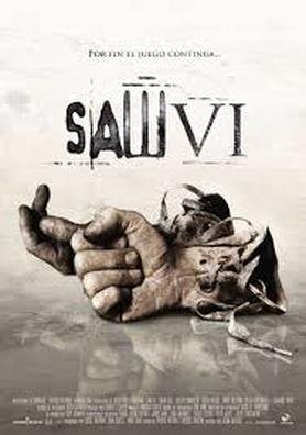
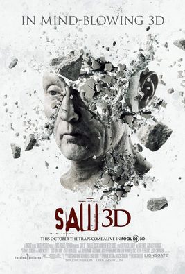
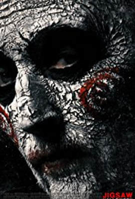
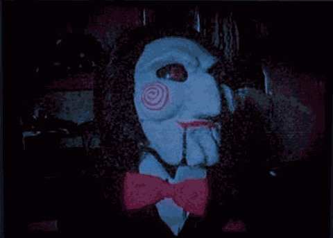
this is One of the successful horrors franchise, globally known as the saw franchise.Saw is an American horror franchise distributed by Lionsgate, produced by Twisted Pictures and created by James Wan and Leigh Whannell, that consists of eight feature films and additional media. In 2003, Wan and Whannell made a short film to help pitch as a potential feature film. This was successfully done in 2004 with the release of the first instalment at the Sundance Film Festival. This franchise has used synergy and cross-media convergence to the fullest throughout the years ever since it was created. Due to this, it has been very successful franchise. They made products such as bubbleheads of the jigsaw killer, a puppet doll and so much more. Good merchandising drives visitors to your film. An attractive exterior influences a customer's decision to come and watch ur film and the saw franchise does this well in doing this.
|
|
|
|
Even throughout the years, the franchise's scheme and overall has stayed consistent in terms of conventions used on posters. They've used body parts as the main dominant image of the poster with the title around it. Even the colour palette has some sort stayed consistent over the years, The white background is used in all expect from one. This background allows the blood to stand out more. The colour white connotes pureness. However, it's been juxtaposed with the body parts of the victims in the film (iconography). However, in their latest installment, they've gone for a new colour palette and removed the typography. This shows they've developed over the 14 years in the franchise and are doing something new.
|
|
|
|
Brand identity In terms of brand identity, they've used a certain typography on the title on each poster . The w is bigger than the other letters, this is key as it allows the franchise to be recognised by the audience. this was consistently done with each instalment. without this, the audience might think it's a fake version of the original as it doesn't have the same iconography
|
|
|
|
profithere is a slideshow of images that displays the gross accumulated across the franchise. This money does not include the merchandise or products made from the company. it shows Only money made from the films. It also shows how much they've made in the opening weekend for each film. The production budget is shown and it says that they've made at least 200% profit from each film. Gross is important For companies as it tells them if their film has been successful or not. Also, it tells them if they should make another installment of the film. This franchise has clearly been success as they accumulate at-least $100 million for each film except from one. This shows that installment wasn't as big of a success compared to the other installments. They've made $453,966,900 million from all 8 installments.
|
MerchandiseProducers rely on merchandise in order to assist selling films. merchandising is important as it allows the producers to keep the film in the audiences' mind long after they have left the cinema. This will make the film more cost effective as the audience may be more likely to return to the cinema to see a later installment in the film franchise. they sell things such as phone accessories, video games, t-shirts, puppets of the jigsaw killer and such much more. they even have a dedicated page on a website that sells only saw merchandise. the merchandise will be highly promoted because it is working in synergy with the film.
|
|
|
This demonstrates the popularity of the franchise. From the video game, (which was based on the first two installments) to the costumes for Halloween. From the the saw franchise is one of the well-known franchises globally. The public can instantaneously recognise the film and its products because of the iconic mise-en-scene as well as the familiar narrative.
|
|
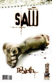
The saw franchise is popular franchise, they have a graphic novel which is a product that can be marketed and aimed at the younger audiences of the franchises. The comic have the same denotations as the film, merchandise and other products from the franchise, aspects such as the same colour scheme and typography. however, it is aimed at a wider target audience. This makes the franchise more appealing to the public thus making them an established and profitable franchise. |
|
spoof/Parody to the film
|
|
|
These are parodies made from other people. This demonstrates the popularity of franchise as others are making versions of their own. it also gives the franchise more advertisement for those who haven't seen the original. this links to the christian metz's theory of the 4 stages of the genre. There's experimentation ,classic ,parody and deconstruction. This falls into the parody category as people creating their own version of the film and making a mockery of it.
|
|
|
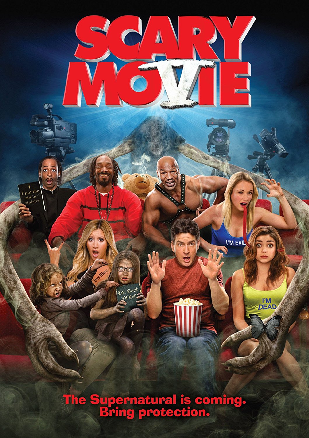
scary move by daniel abeshin
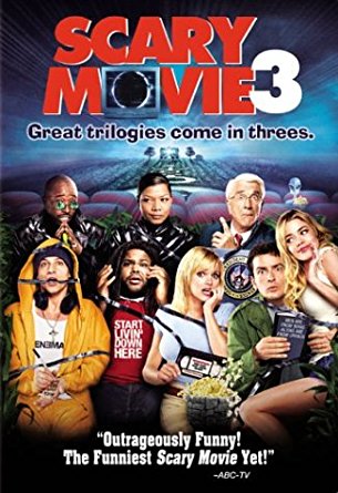
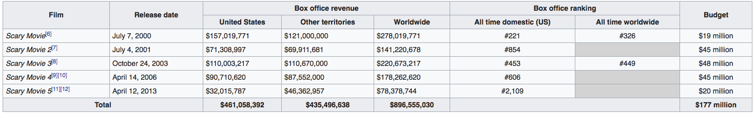
Scary Movie is a series of American horror comedy parody films created by brothers keenen, shawn and Marlon wayens. the movies were produced by Dimension Films and distributed by Miramax Films and The Weinstein Company. Each movie in the series parodies popular horror films. Scary Movie's main parody is of Scream and I Know What You Did Last Summer, The Sixth Sense, and The Matrix. Scary Movie 2 primarily parodies The Haunting; the opening sequence copies the Exorcist while the rest of the film contains traces of What Lies Beneath, Poltergeist, and The Amityville Horror. Scary Movie 3's generally parodies The Ring and Signs.
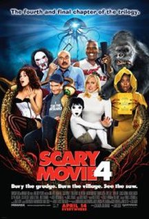
Scary Movie 4 largely makes fun of the Saw films, The Village, The Grudge, and War of the Worlds, Scary Movie 5's areas of satire are the Paranormal Activity film series, Mama, Black Swan, and Rise of the Planet of the Apes. Other notable parodies are those of The Cabin in the Woods, Evil Dead, Fifty Shades of Grey, Inception, Sinister, and the Madea series.
Scary Movie 4 largely makes fun of the Saw films, The Village, The Grudge, and War of the Worlds, Scary Movie 5's areas of satire are the Paranormal Activity film series, Mama, Black Swan, and Rise of the Planet of the Apes. Other notable parodies are those of The Cabin in the Woods, Evil Dead, Fifty Shades of Grey, Inception, Sinister, and the Madea series.
|
|
|
|
|
The franchise is consistent in terms of using the conventions of previous horror films. The movies draw on notable themes and conventions in these popular horror films. We see in the first movie, the iconic protagonist from scream is visible in the poster. There is a constant stream of iconography from other films seen in the franchise making it more noticeable and culturally relevant. The franchise follows and breaks normal horror movie conventions, making use of ideas teen horror and childhood innocence, but not leaving a final girl. they have used a simple colour palette and standard typography. this makes the movies recognisable and eye-catching. This shows they've developed over the 14 years in the franchise and are doing something new.
|
|
|
|
|
|
profit
here is a slideshow of images that displays the gross accumulated across the franchise. This money does not include the merchandise or products made from the company. it shows Only money made from the films. It also shows how much they've made in the opening weekend for each film. The production budget is shown and it says that they've made at least 200% profit from each film. Gross is important For companies as it tells them if their film has been successful or not. Also, it tells them if they should make another installment of the film. This franchise has clearly been success as they accumulate at-least $100 million for each film except from one. This shows that installment wasn't as big of a success compared to the other installments. They've made $453,966,900 million from all 8 installments.
merchandise
Producers rely on merchandise in order to assist selling films. merchandising is important as it allows the producers to keep the film in the audiences' mind long after they have left the cinema. This will make the film more cost effective as the audience may be more likely to return to the cinema to see a later installment in the film franchise. they sell things such as phone accessories, video games, t-shirts, puppets of the jigsaw killer and such much more. they even have a dedicated page on a website that sells only saw merchandise. the merchandise will be highly promoted because it is working in synergy with the film.
Branding identity
the typography of the resident evil logo is distinct as it has a certain style and font added to it. the fact that the 'R' is positioned in a way, it allows for the logo to be more recognisable. in addition to this the typography is different from the game and film as the game logo has a more block font.
comparison of real media text and our product
by Charles whitewood
correlation between the trailer & magazine
|
|
|
|
real media text: a nightmare on elm street
After analysing both the trailer font and the magazine fonts you can clearly see a relation between the two as both of the fonts have used a make-do/jagged/handwritten type of font which gives the viewer a scary atmosphere. Moreover to this both of the fonts have kept the same colour scheme which is red to connote death, danger, violence and more which foreshadows what happens in the actual films. Secondly, when viewing these i can see that although the backgrounds look quite different they all have something in common that make them similar which is that they have a lonely vibe that is freaky, one being dark and scary and the other being a bright sky that has no one to help them. With the trailer the backgrounds predominantly consist of dark and violent backgrounds. When it comes to characters it is evident that the Magazines like to use Freddy Krueger (the main antagonist) as the dominant image as he is highly recognisable and is the biggest fear/threat in the films.
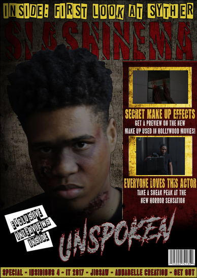
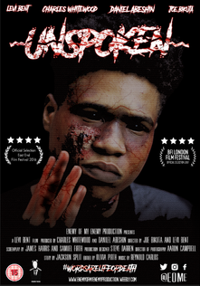
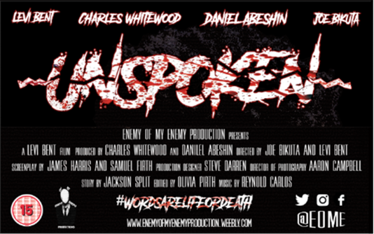
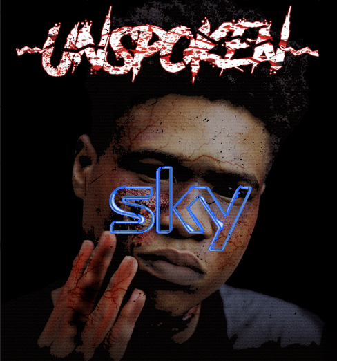
our products: Unspoken
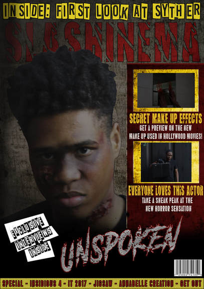
we have followed the same way of continuing the font onto all of our products through the trailer and magazine as we have used a brush type of font that makes the title look improvised and make-do as if the antagonist had written it. In-addition to this we added blood splatters to it so that it would connote death. With the background we have followed a similar pattern by making it quite dark and typically sketchy so that so that the consumer is on edge. Moreover we have followed a nightmare on elm street by ensuring that the main antagonist character is on the front cover, making him clearly the most important character in our trailer. We had done this to show that the character is recognisable.
|
With our main antagonist character we made sure that we referred to and included the appearance of the character so that people know and understand what they are looking at and that he would be the iconic character from the trailer. by doing this on all media products it created a familiarity for the viewers to look at. Also by keeping the characters to a minimal it prevented the audience from any confusion and guaranteed that the viewer would link this character to the trailer.
|
|
As you can see with the background we have kept a usual trend in the way it looks through out all of our products by making them all seem quite lonely, we did this by using prison cells. we also did this in the magazine by using a grungy looking background. Furthermore by making the background look dark it creates tension for the viewer and makes the magazine more interesting.
|
|
poster & magazine
|
|
the magazine has not carried the typical font style in comparison to the poster as the magazine has decided to use a more professional and proper font were as the title for the poster looks more hand written and therefore more creepy and intriguing to look at. In regards to the background i would say that the poster looks more dark and sinister however the magazine has still managed to maintain a dark background to show that the film is scary. Thirdly with the colour scheme the magazine and poster look highly similar as both products use the colour red and yellow on their fonts to connote death, blood and a false sense of security with the yellow. Finally and very importantly the two products have continued to use the main character as he is an icon and makes the brand easily recognisable.
Our product: magazine and poster
|

|
With our products we made sure that we continued the main traits of the title in-order to make it recognisable and so we kept the same font with the blood splatter and slightly changed the colour to make is more sinister. For all three of our media products we have used a strict colour scheme that suits the sub-genre and fits the style of product we were trying to make by using both handwritten/brush looking fonts (the title) and simple san serif fonts to make the magazine and poster look classy. Moreover with the magazine and poster we decided to use the same main character as the dominant image but with different poses, this allows us to keep our brand identity and also gave consistency to the viewers thus preventing any confusion between the magazine and poster.
our subsidiaries that we own: by joe bikuta
|
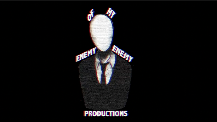
enemy of my enemy: productions
enemy of my enemy productions has shown their understanding of branding amongst media conglomerates, media groups or media institutions. we have decided to turn our production company. enemy of my enemy Productions, into a subsidiary of a large media corporation. we Took a lot of inspiration from existing multinational media corporation
|
|
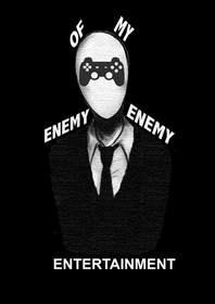
enemy of my enemy: entertainment
enemy of my enemy ENTERTainment s an industry that can create a variety of video and computer games. They could create games which involves the film being in it produced by enemy of my enemy productions.This use of synergy increases profit sales for both media platforms. This logo uses brand identity as its taken the same shape of the main logo. |
|
|
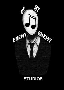
enemy of my enemy: studios
enemy of my enemy studios is a popular music company in the industry as they known for their great recording artists. the logo is similar to the enemy of my enemy productions' logo as it is linked to the film so this allows the franchise to get a larger audience via music. this logo uses brand identity as its taken the same shape of the main logo, however to promote the music, we added a music note within the face to keep the same house style.
|
|
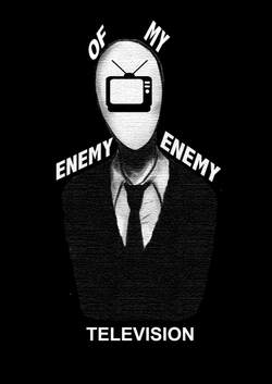
enemy of my enemy:television
enemy of my enemy: television is another way to gain profit for the franchise. The television studio could broadcasts several programmes that are popular worldwide also produced by The enemy of my enemy team. this advertises us as a production company making the viewers want to watch more films. this logo uses brand identity as its taken the same shape of the main logo, however to promote the television, we added a tv within the face to keep the same house style.
|
|
the official soundtrack
by joe bikuta
|
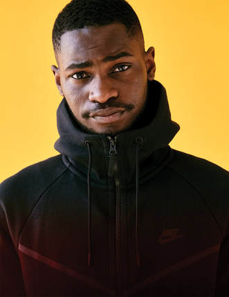
This is the official soundtrack for the film 'unspoken'. We signed the uk artist Santan dave to our record label: enemy of my enemy studios. we have chosen to use this artist because his music fan base is broad and with his music, we can target multiple demographics. The soundtracks also features other famous artists such as jhus, drake and others. The soundtrack consists of different genres.
|
|
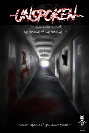
graphic novel by joe bikuta
|
here is a graphic novel version of our film, unspoken. This is to promote our film even further by releasing novels of the film in order to attract more people to watch the film, including those who may enjoy graphic novels. Films have had books/graphic novels written from them and films are often made out of books, such as The Hunger Games. Stephan King is an author who writes horror, and many of his novels have been made into horror movies such as I.T. Books and Films do not always share the same house style. However, we have decided to keep the typography the same to reinforce our brand identity. |
synergy through media platforms
by Charles whitewood
|
|
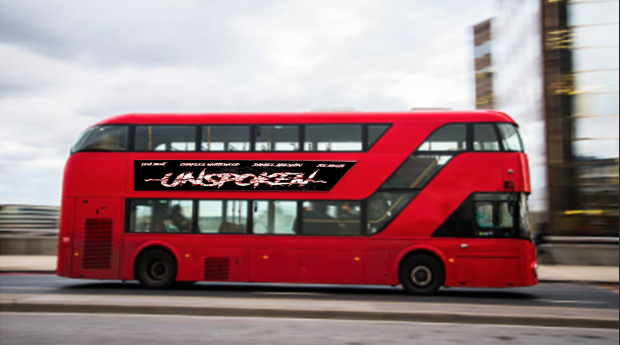
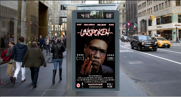
As you can see i have used three different formats of advertisements which is a normal street billboard that is on a bus stop shelter, an electric billboard that is hanging above the motorway and lastly an advert across a bus. The point of having a poster on a bus stop is that there are multiple people that walk past and stand by bus stops meaning that the product will be seen and well promoted. The use of an electric billboard is that you are bale to see more about the film such as the actors, awards and credits which might attract certain people that like other actors. Having these billboards are highly useful as they are big and attract a lot of attention and this particular one is over a motorway which is guaranteed to let loads of people view the poster. The last one i chose is the bus its self which is one of the best ways to promote the film because thousands of people see and get on buses. In-addition to this buses travel through several places which allows a mass audience to view our promotion. Using billboards are one of the most effective ways to promote a product as so many people see them and are visible through out the whole day every week. Furthermore by using my poster i have enabled it to keep the same font which makes the brand identity more reinforced.
|
As you can see we have created an apple store top charts, apple store description page and a google play top charts page for our productions game and app. The purpose of making this app is in-order to promote the film to wider audience and to gain different target audiences. By making a digital app would mean that we are targeting a younger audience of roughly 12 to 18 because the younger generation use digital technology the most. This app has been made to purchase for free because we only want to gain more viewers and give them an idea of what the film would be like upon it's release without the deterrent of having to pay. Finally we have stayed with the same production logo, poster and we have used continuity through the title, fonts, and characters that are shown in the trailer.
|
|
synergy through media platforms (by joe bikuta)
|
|
|
this is our limited edition ps4/xbox one. It consists a special wrapped console with the official game "unspoken the game" with it. We worked in synergy with microsoft and sony to produce this. this was key as it allows our name to reach a wider audience. also, the point of doing this is to target those who play console. This would be very effective as there millions of people who utilize at least one of the consoles. This gives us brand exposure to those use the consoles. IN addition, we've added our brand new game along with it and it may attract those who are fans of horror games. In order to keep our brand identity, we added our logo at the bottom and we've kept our typography the same to reinforce our brand identity.
synergy through media platforms (by daniel abeshin)
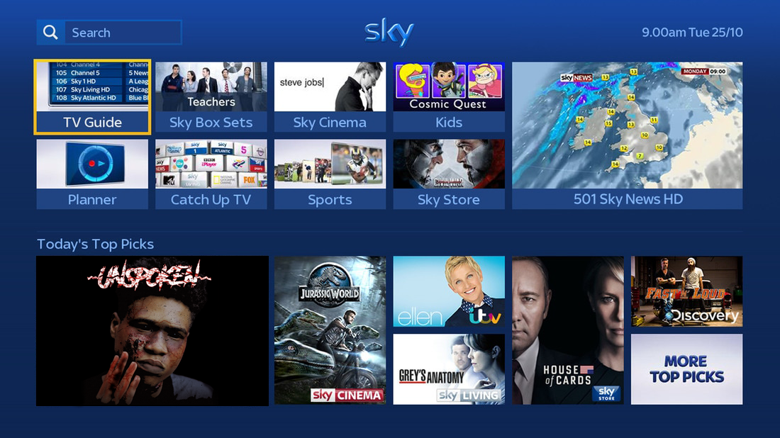
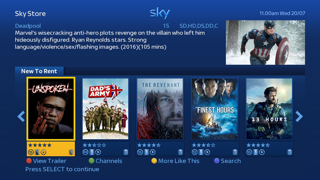
SKY STORE
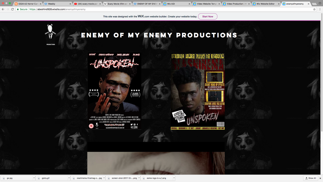
EOMY WEBSITE
lego movie poster
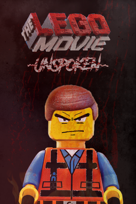
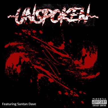
This is a poster of our film, UNSPOKEN, produced with a partnership with Lego. Over the years there have been many films released in cinemas that also release a Lego movie just after for the younger audience to watch and therefore this would be more toned down so that its suitable for the younger audiences. Through this poster we have used a Lego character with wombs on his face also including "UNSPOKEN" logo/ branding at the TOP of the page to allow the audience to know that this product promotes the real movie. We have also used similar colours such as red white and black to go with the rest of the products colour scheme AS WELL AS THE USUAL LEGO COLOURS.
BILLBOARD POSTER
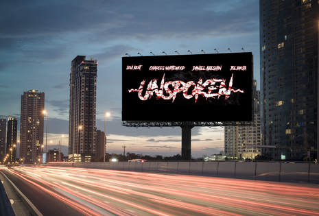
I have created a billboard that features out movie logo on a busy street. Billboards are one of the best ways to advertise as film as they can be seen by thousands of people. The poster uses the same colour scheme and typography which also links to the branding ofour film.
unspoken sequel
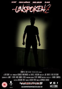
here is a sequel for our horror movie. the Sequels continue the story of the original with the same antagonist and different protagonists. Sequels typically feature a number in the title. I have changed the layout for this horror movie poster using a silhouette of the antagonist. this shows the difference in films. the changes visually help the viewers differentiate between films.
UNSPOKEN GRAPHIC NOVEL
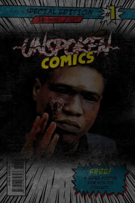
here is a graphic novel front cover. Many movies and tv shows have been turned in to comic books in order to make more money. I decided to make a graphic novel as another form of communication. I used the same typography for the book as the film poster as it will make the product more recognisable. I have used the same colours red white and black. I have used classic comic book fonts using my Photoshop skills to show audience members that this is a graphic novel.
film feature on cineworld and netflix
by charles whitewood
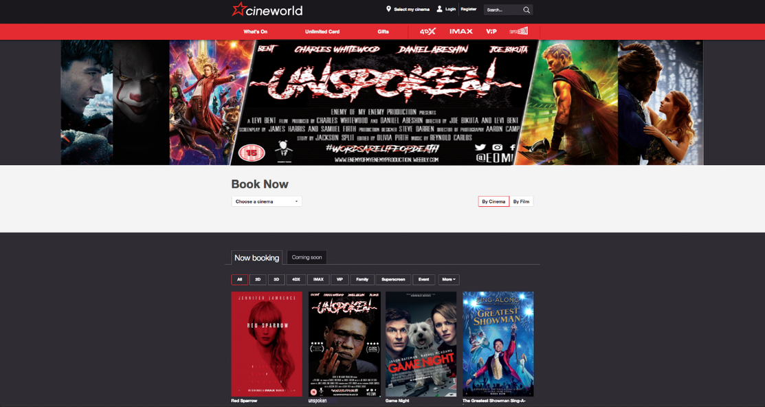
As you can see from this screenshot we have our film poster, title and credits on the cineworld homepage. We chose to have our film featured on this cinema brand due to the fact that they are known through out the whole of the UK with 81 cinemas and over 800 screens. We chose this cinema branch because we knew that the film would reach a wide audience that varies in age, gender. After looking at the website they typically decide to show a reel of well known characters and titles at the top of the page as this will interest the viewers, in-addition to this we have our title and credits on this reel which heavily promotes the brand because it is one of the first things that you will see. After scrolling down you will be able to see 4 films that have recently come out and have been placed there because it is at the consumers best interest as they are seen as the best films. our film has also been placed there as the second viewable film. using this website also gives you the direct option to book tickets for the film. Our film has been put in the now booking section as at the time of the screenshot being taken it was halloween which was done on purpose because it will fit the typical time to have a horror film release. Also, when putting posters and titles on the homepage we made sure to keep the same font, colour scheme and characters to reinforce our brand identity and to show continuity and to ensure that the film is easy to recognise.
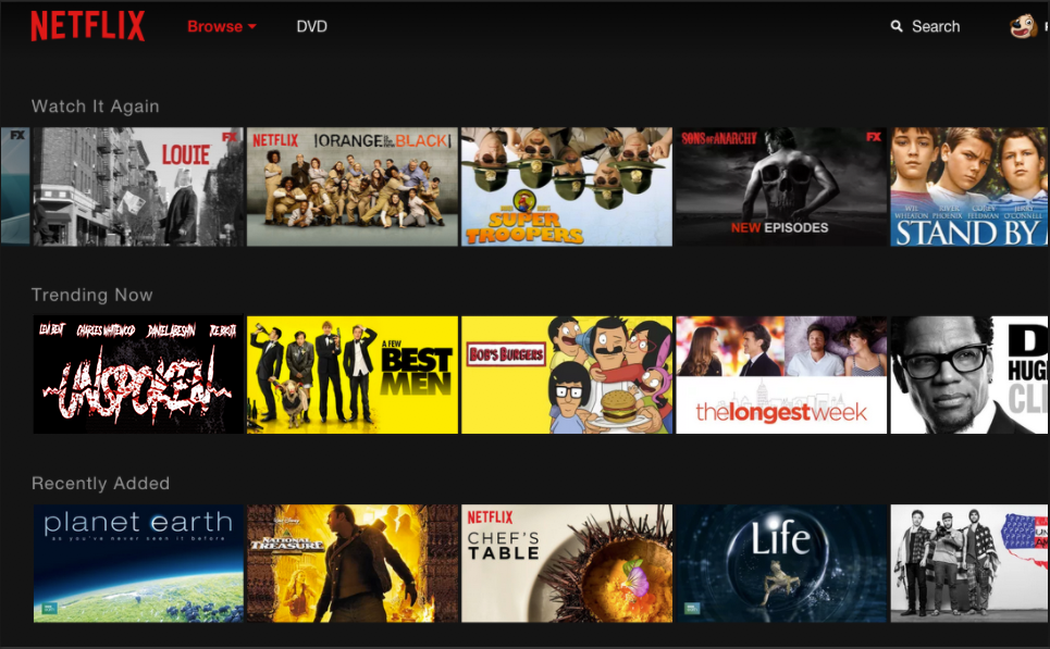
As you can see our film has been uploaded onto the main homepage of Netflix. Netflix is a website that allows its subscribers to view a wide selection of different films an tv shows after paying a small monthly payment. We put our film on Netflix as they are the best and most popular website for people to watch films as there are millions of users on the site but there are millions of consumers that watch horror films which means that having our film on Netflix will allow us to attract the widest target audience possible. When uploading an image to this page we decided to use a simple yet effective image so we used our title, in doing this it meant that we were able to keep a strong brand identity, and continuity so that people know what they are looking at. Furthermore we used the same colour scheme and font because it made the film easily noticeable as a slasher horror film.
synergy through platforms (by levi bent)
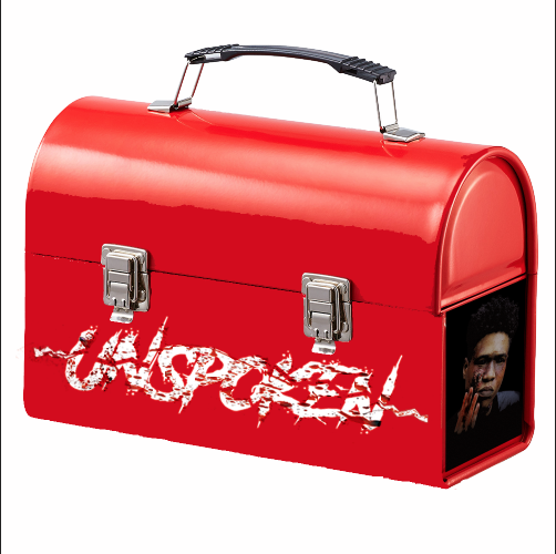
The idea of creating a portable household item allows for easy word of mouth and will help encourage different audiences to watch the film. In-addition by having a lunch box as a product it is very easy to increase your fan base because all children have them and require the parents to see and buy them. Furthermore we have used the same font and colour scheme to make the film easily recognisable.
|
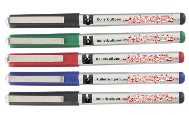
Pens are another highly effective way of promoting our film due to the fact that everyone owns a pen and is easy to see when it's being used, this product might not even be sold it could be given as a free sample which will interest the consumer from the start and having these pens shows that we are versatile and working with our typical target audience of young adults from 18 to 25 as they would rather something that they can use instead of a toy, this shows that we can cater to all viewers.
|
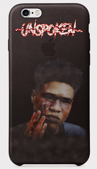
Lastly we have a phone case which would be one of the most popular pieces of merchandise as every person has a phone and a majority of people use cases. further more there has been a huge increase in the use of technology as we live in a contemporary society that revolves around using gadgets to communicate, this will result in the film been advertised highly as people will constantly have their phones out.
