evaluation question 3:
what have you learn't from your audience feedback?
our target audience
Our typical target audience for our product would be any gender as we have both genders in the trailer and cater to both genders by using stereotypes. The usual age range would be between 17 to 24 as people of this age will be able to relate to the trailer as the characters are 17 or older. Thirdly the audiences preference would normally be horror and the sub-genre would be slasher because that fits our products features.
overview of audience feedback
By daniel abeshin
Audience feedback is a vital part when creating and developing our products in-order to ensure that what we make is creative and appeases to what the consumer likes to see, by doing this it makes sure that we have typical structure to our products and that we follow the conventions of our sub-genre.
We were able to get target audience feedback by taking surveys that questioned what people liked about each product before and after the final release of the product which allowed us to see the development of our magazine, poster and trailer. To provide the audience with successful questions we used digital technologies such as; survey monkey to ask the questionnaire, Instagram to promote the product and the survey which was highly effective due to the fact that our target audience is 15 and above which is useful as all teenagers aged 15+ use social media, this will increase the chance of getting good feedback. Getting this feedback taught us that everyone likes different conventions in horror and this allowed us to satisfy what they want by including what looked appropriate in each particular product.
We were able to get target audience feedback by taking surveys that questioned what people liked about each product before and after the final release of the product which allowed us to see the development of our magazine, poster and trailer. To provide the audience with successful questions we used digital technologies such as; survey monkey to ask the questionnaire, Instagram to promote the product and the survey which was highly effective due to the fact that our target audience is 15 and above which is useful as all teenagers aged 15+ use social media, this will increase the chance of getting good feedback. Getting this feedback taught us that everyone likes different conventions in horror and this allowed us to satisfy what they want by including what looked appropriate in each particular product.


|
Facebook is an online social network service. it was This was founded in 2004 . This social network site allows anyone above the age of 13 years to be a user. it allows Facebook allows friends and family to communicate all online, different ways this could be done is by sharing photos, videos, links and texts. Facebook is very popular. it is a great way to gain feedback from our audience as this social network can be accessed by anyone on any device.
You Tube was launched in May 2005, YouTube allows EVERYONE TO discover, watch and share originally-created videos. YouTube provides a forum for people to connect, inform and inspire others across the globe and acts as a distribution platform for original content creators and advertisers large and small. Twitter is an online news and social networking service where users post and interact with messageS. tweets ARE restricted to 140 characters. Registered users can post tweets, but those who are unregistered can only read them. Users access Twitter through its website interface, SMS or a mobile device app. Snapchat is an image messaging and multimedia mobile application created by Evan Spiegel, Bobby Murphy, and Reggie Brown, former students at Stanford University, and developed by Snap Inc., originally Snapchat Inc. More than 1 billion people in over 180 countries use WhatsApp1 to stay in touch with friends and family, anytime and anywhere. WhatsApp is A free . MESSAGING APP THAT OFFERS ENCRYPTED messaging and calling, available on phones all over the world. Due to its amount of users, this is a great way to get our products out therefore the target audience to respond commenting on positives and negatives. Instagram is an online photo sharing site that allows its users to share pictures and videos either publicly or privately on the app, as well as through a variety of other social networking platforms, such as Facebook, Twitter, Tumblr, and Flickr. Originally, a distinctive feature was that it confined photos to a square shape. |
Teaser trailer
by joe bikuta
the image displays the analytics of our trailer. It shows how much people watched it and where exactly.It says 100% of the viewers were from the united kingdom. It also tells me who watched our trailer in terms of gender. 85% of those who watched it was male and 15% was female. This is key as it tells us who our demographic is. It also tells us up until when they kept watching. It says the average watch duration is 0:55 which demonstrates that our trailer kept the audience enticed for most of the video . In the analytics tells us the people aged from 13-24 viewed our trailer the most. This tells us who our target audience is.
|
I asked several people what they had thought about my trailer. I asked them to give back two positives and two negatives. This was key as it allows to see us what we done well and what we needed to improve on. I used two social media platforms such as; snapchat and whatsapp . The general consensus was that the trailer was good all-around. However, they weren't horror fans so therefore they would be amused. I proceeded to ask two hardcore fans to review my trailer and i received more constructive feedbACK. They said the trailer was okay but could of been better. THIS DEMONSTRATES THAT IT DOESN'T REALLY APPEAL TO a HORROR audience.
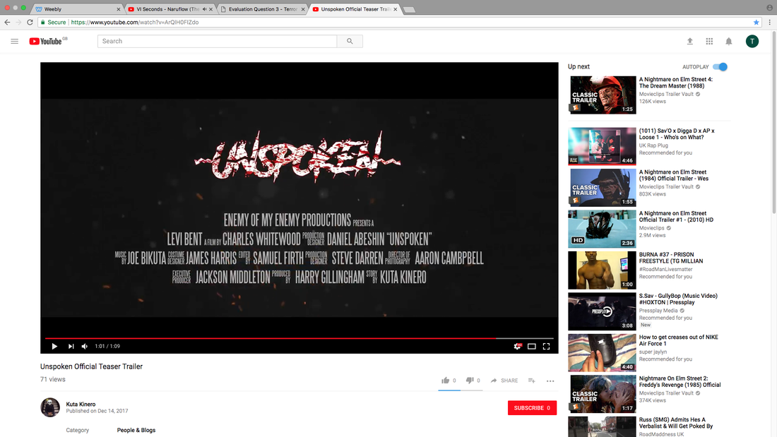
We uploaded our trailer on Youtube and the data we gathered showed us how many people viewed our trailer, what age and gender viewed our trailer. it tells us that only 71 views but no comments or likes. the video didn't receive many views as we didn't do much advertising for the trailer.
|
what i have learnt about the audience research is that the trailer was appealing to a non-horror fan audience. However, it wasn't as appealing for the horror fan audience. They've given constructive criticism on what to improve in our trailer. To improve, we would need to look at more popular film trailers which entice the audience. I don't think we used the right conventions for trailer
|
ThIS IS A VIDEO OF PEOPLE REACTING TO OUR TRAILER. THIS WAS ESSENTIAL AS WE WANTED TO KNOW IF OUR TEASER TRAILER WOULD APPEAL TO OTHERS.
|
THIS IS OUR SURVEY FOR OUR TRAILER FOR OUR TEASER TRAILER. IT ADDRESSES QUESTIONS SUCH AS DOES THE TRAILER APPEAL TO YOU , DOES THE SOUND MATCH THE ACTION ETC..
|
magazine feedback
By Charles Whitewood
The use of survey monkey and social media such as: Instagram and twitter mean't that we would be able to make adjustments to our products, know our strengths and weaknesses, know what looks most professional and lastly i got to know what conventions had to be used in particular products in-order to make them structured. However once we had target audience feedback we had to ensure that the product was balanced between what the consumers want and what message we are trying to get across, failing to do this can make the product look confusing and unrealistic.
|
|
Through out this feedback i had learnt what people like on my magazine and what they didn't like about my magazine which resulted in me being able to improve the drafts of the front cover so that it suited what picture we wanted to paint for our trailer and so that the magazine looked professional. The results on our final magazine draft explain what people like the most and what they aren't so keen on which is what got the magazine to wee it is now.
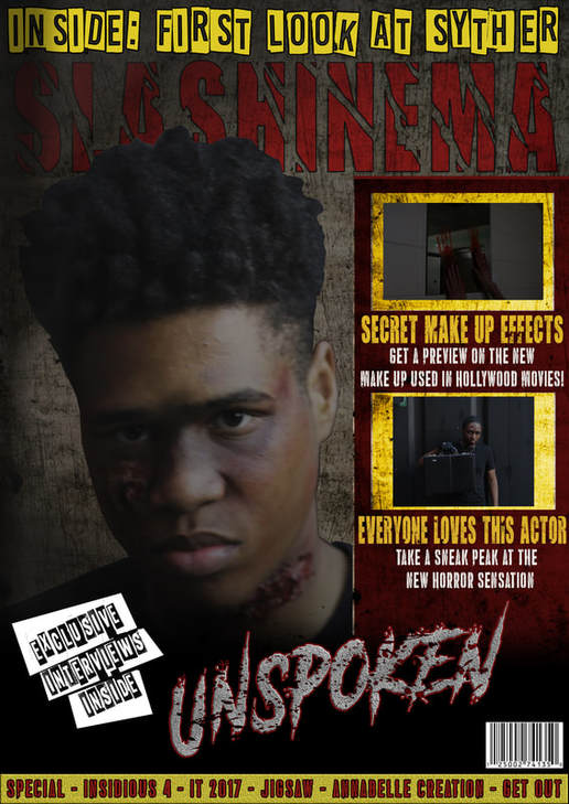
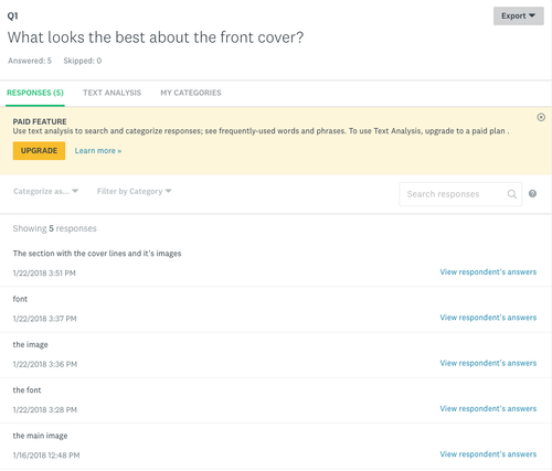
From question 1 you can see that the main image had a big impact on what the viewer liked most which as good as the main image is typically supposed to grab the audiences attention. this was also good because our images character had wounds around him which was meant to connote a slasher sub-genre. As you can see there were two people that liked the font the most which is because we had used a small variety of different fonts that created the atmosphere of an eery horror film and made the audience feel involved in the magazine. People also liked the main image and this is could be because of the good use of make-up effects and the way that the characters poses and portrays himself. Lastly people liked the cover-lines and this shows us that the colour, font and positioning of the cover-lines were well thought out and brought the consumers attention to it without taking to much away from other main features.
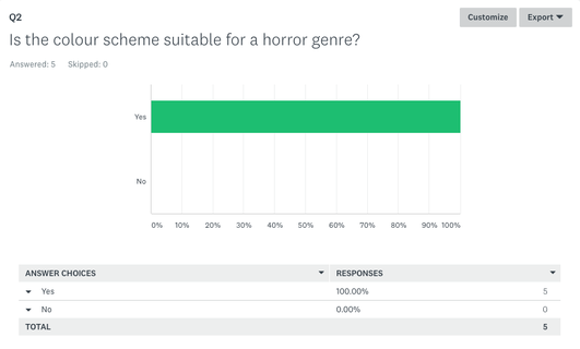
The second question evidently showed us that the colour scheme was highly effective and that we followed the structure correctly and was done in-order to portray the trailer as bloody to follow the typical slasher sub-genre and made the magazine attractive to look at. Moreover the fact that the colour scheme was suitable aided us in being able to apply these colours through out our products which created a consistent palette and makes the brand recognisable.
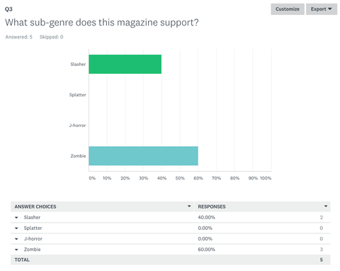
Question 3 demonstrates to us that our magazine was clear that it was a slasher however there was some confusion as others thought that it was a zombie, and this can be sorted out by changing a few features in the magazine for example we could make the character (dominant image) less bruised to put him across as a human. We knew that this would be seen as a slasher also because we were able to create wounds and blood.
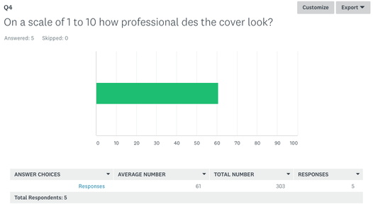
Question 4 suggested that our front cover looked very professional in comparison to real life magazine front covers and this was clear as the average scale number was 61. However because the scale wasn't %100 this showed us that we could have improved the cover by perfecting certain parts such as the title as the left side was very dark and made it look weird.
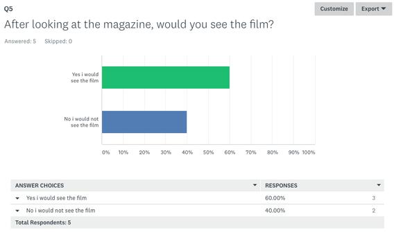
Question 5 told me that our audience would most likely watch a film if it was released and this allowed us to know that our products were successful to a certain degree. On the other hand %40 of people said that they wouldn't watch the film and this showed us that we could have improved the trailer by making certain parts such as the jump scare more significant and bloody to ensure that the trailer is a clear slasher.
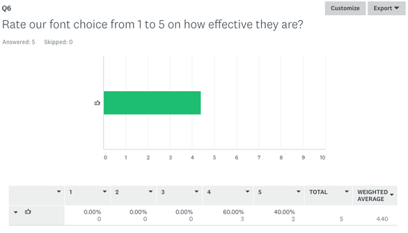
Question 6 was a rating and it let us know that our font choice was good because it looked effective and made the trailer look scary because of the font used. %60 of people gave the font choice a 4 out of 5 and this man't that our fonts created the correct idea for the viewer and could have had an impact on wether or not people would watch the film.
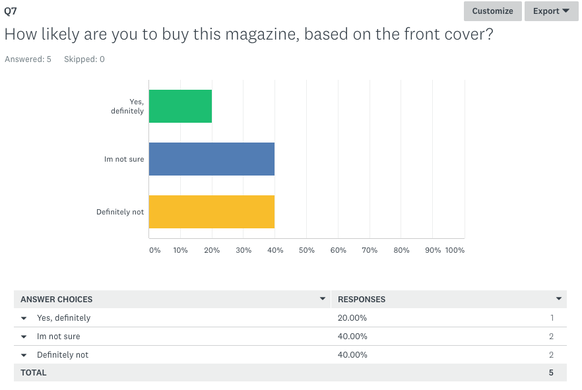
Question 7 clearly demonstrated that people would not be willing to buy our magazine which was unfortunate but could be due to factors such as it being too expensive however there was at least 40% of our audience that would be willing to buy the magazine which let us know that it still looked good. Secondly the people that said they wasn't sure told us they they weren't able to make a decision.
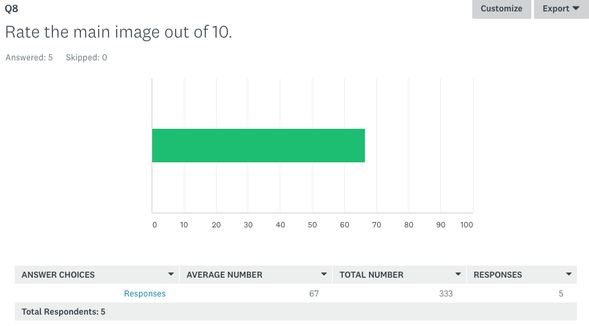
Question 8 further reinforced that we had created an effective main image due to the fact that its average rating out of 100 was 67 and this is very encouraging because it shows that more then half of our target audience like the style of photos that we used. Through the photo in the slideshow it is clear that our magazine cover promoted the trailer well because a high majority of the survey takers said that it did.
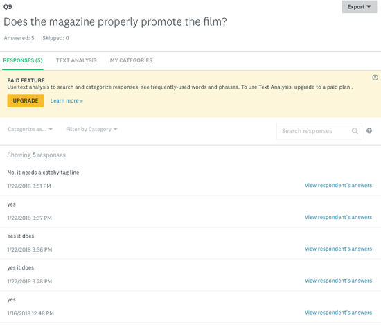
After looking at the feedback from question 9 it was evident that people thought that the magazine properly promoted the film due to the fact that it had a title that stands out and the main antagonist was the dominant image. on the other hand one person thought that it required a catchy tagline which is understandable as it would make the film easier to remember and could be an iconic/recognisable part of the trailer which would excite viewers.
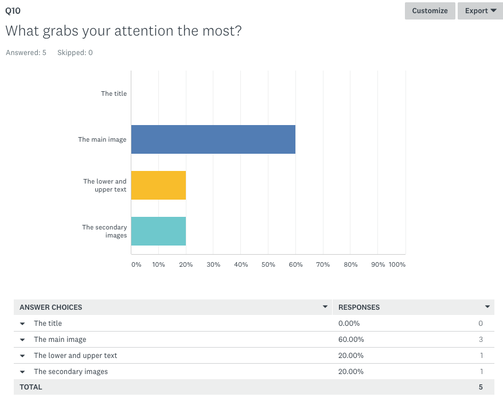
Lastly question 10 bluntly tells us that the main image was the most attractive to look at followed by text and this might be due to the way it was positioned and the secondary images both being at 20% and this enabled us to realise the key conventions of a magazine and what is needed which is a main image, text and secondary images as they get the audiences attention the most.
conclusion
To conclude i feel that once we had got this feedback and put it to good use the magazine had improved a lot and was successful for a majority of our target audience. Moreover to this we knew what the best features of our magazine was for example: it was clear that people liked the dominant image as it was widely spoken about across each question. This also aided us in knowing minor faults in our work that could lead to very strong looking content. The fact that the mass of people asked liked our magazine suggested that people were highly impressed with our work and that it followed the slasher sub-genre very well.
poster feedback
by levi bent
|
feel free to complete this survey on our poster.
|
|
our poster
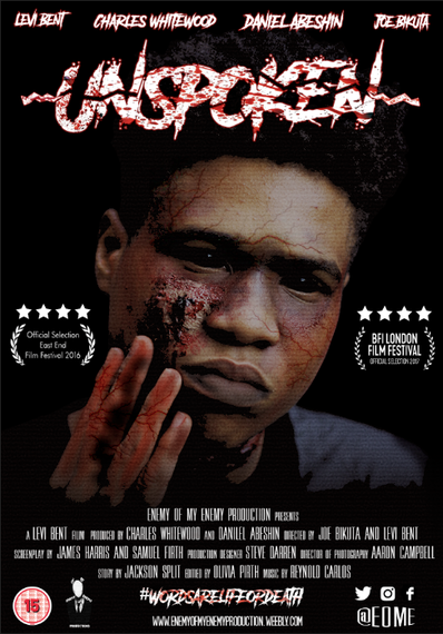
based on the results from our
|
the use of questions such as:
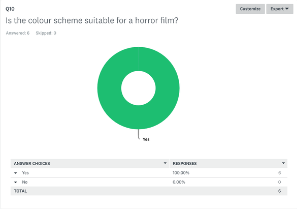
1. On a scale of 1-10 how much would you rate this poster 2. Does our poster reflect a horror slasher sub-genre. 3. what would you rate our mast headline out of 10? 4. After looking at the poster, would you watch the film? 5. How likely are you to buy this poster? 6. Does the Poster properly promote the film? 7. Rate the main image out of 10 8. What's the best feature of our Poster? 9. What grabs your attention the most? 10. Is the colour scheme suitable for a horror film? has allowed us to collect an accumulation of results that enables us to analysis the audiences opinion an how successful our poster as. 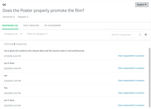
|
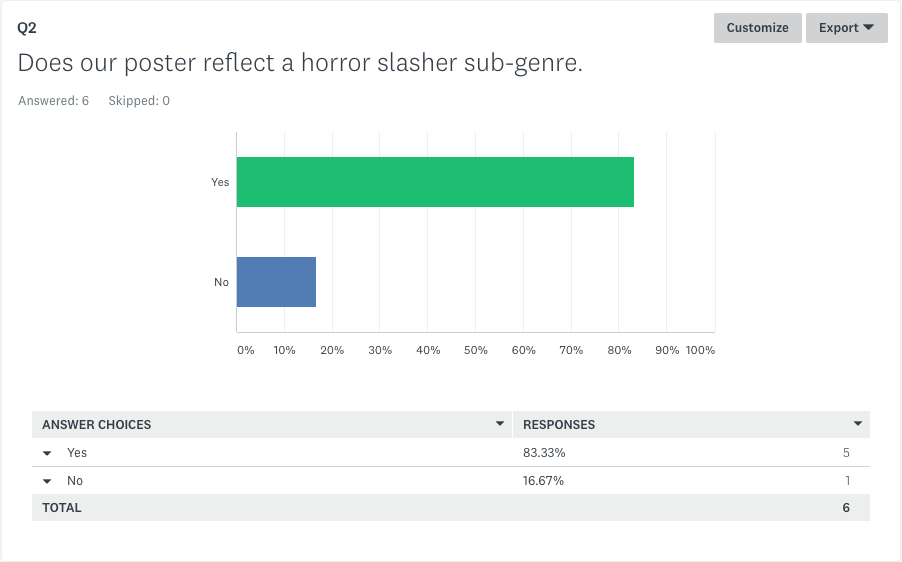
With the feedback stating our colour scheme is suitable for a horror film implies that our poster follows typical conventions of a horror film.
|
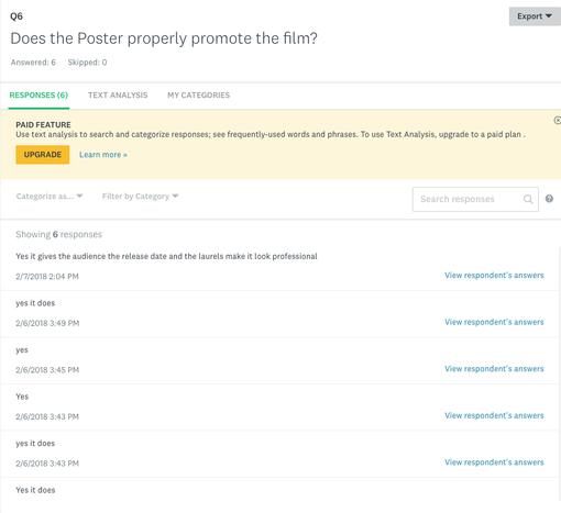
the question shown above allows for us to identify if the poster coincides with the film trailer. it also allows for us to review comments given and how we could improve the poster for it to promote the film.
|
|
|
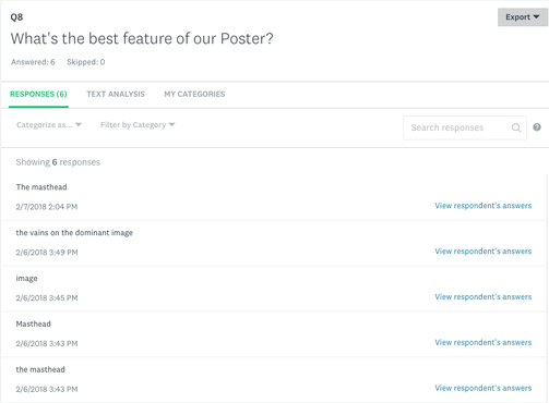
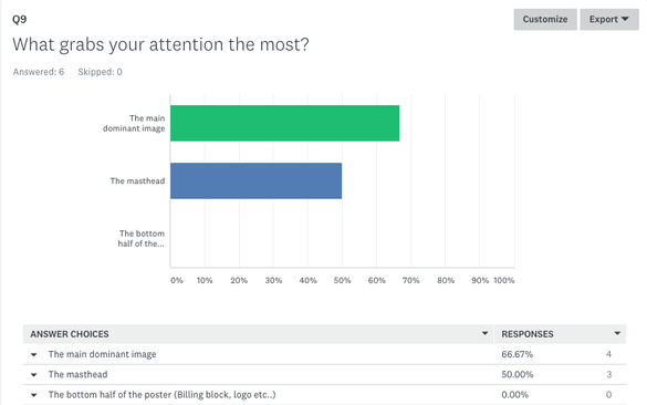
We collected some of the results from survey monkey and the results shown overall are positive which helps implicate that our main intention of replicating a slasher sub-genre movie poster has been achieved. furthermore as we delved further into certain questions such as question 8 (seen below), this helped give the audience a voice for choosing which aspects of the poster looks the best. In addition we see question 8 have various answers that also present the positive impact of our poster. finally with 50% claiming the masthead grabbed their attention the most, it would seem that the split decision of attentive aspects shows how diverse our poster was. overall the main dominant image was a huge instant hit as a favourite element of our poster .
although we have received positive feedback on a whole from the survey the accuracy of the poster feedback could be incorrect as we have received minimal feedback from candidates creating a biased view on our survey. To improve this more responses would have to be obtained to have the correct feedback and have an even amount of responses.
although we have received positive feedback on a whole from the survey the accuracy of the poster feedback could be incorrect as we have received minimal feedback from candidates creating a biased view on our survey. To improve this more responses would have to be obtained to have the correct feedback and have an even amount of responses.
|
|
|
|
|
|
Poster Feedback interview
by levi bent
|
|
|
|
overall conclusion
For the duration of receiving our audience feedback i think that we have obtained a huge amount of constructive feedback that has shaped, developed and made our products unique from everyone else's but has followed the required conventions so that what we made looked interesting, realistic and well structured. Receiving the negative feedback meant that we could adapt certain parts of our product to cater to what a majority of the audience want. On the other hand with the positive feedback we were able to see what works well. Unfortunately we were unable to get a lot audience feedback which mean't that we were not able to learn a lot from the feedback.
If we were able to do the teaser trailer again we would change
If we were able to make changes to the poster we would
If we were able to make adaptations to the magazine we would
If we were able to do the teaser trailer again we would change
If we were able to make changes to the poster we would
If we were able to make adaptations to the magazine we would
